2013 Parade of Homes
Sneak Preview at Jerome Village
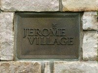
I had a sneak peak at the Parade of Homes today. Specifically I refer to the 2013 BIA Parade of Homes today in the Jerome Village subdivision.
There actually is a village of Jerome just down the street from the the new development. It is a sleepy little town of a few dozen houses, or less, that is soon to be joined by several hundred new homes. Such is the nature of growth and sprawl.
It will, however, be joined by some very well-to-do neighbors. These subdivisions are nicer homes. Many of these will be families attracted to the area because of the general reputation of the Dublin School District.
The Parade this year consists of 13 homes by 11 builders. The houses are all contemporary takes on traditional house styles. Most should properly be called neo-something, or perhaps such-and-such revival. There was, for instance, a lovely Italianate, that at first glance would blend in well in many an 1850’s neighborhood, except for the subtle indications that this was built for someone with early-21st century sensibilities. I will get to that later.
I was able to get into two homes. The rest were in various stages of getting ready for the show, with workmen in-and-out, and not quite ready for me. They will be ready come June 15th, when the show starts.
In the one home I was able to talk to the partner owners of Prism Construction, Mike Hamill and Jim Dearing. I was able to interview them and get the lowdown on various aspects of the house. Excerpts of that interview, along with pictures of the house, inside and out, are shown in this attached page focusing on their Neo-Georgian home.
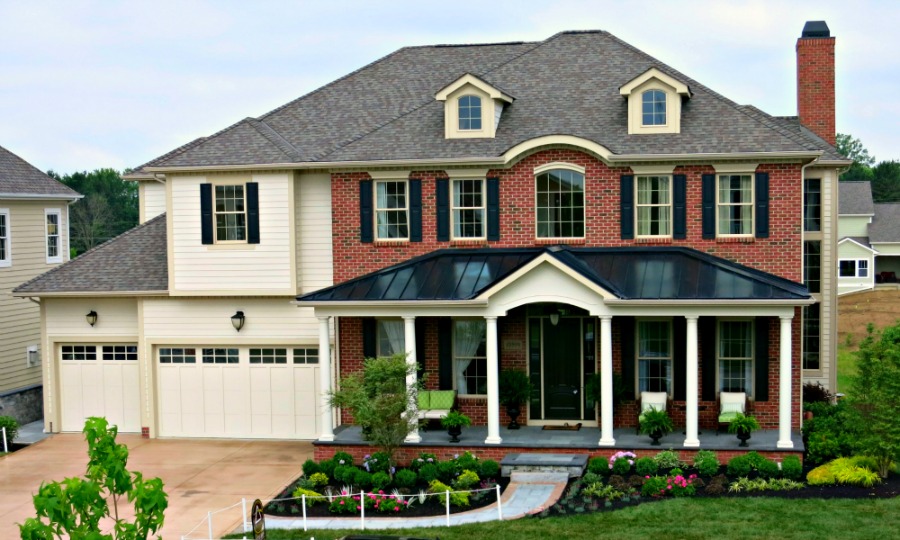
This is the Prism home I toured. The main part of the house is Georgian, albeit with a full front porch.
The second home was an unguided tour, but I also have some great pictures, and was able to fill in some details. I will be posting those photos shortly.
The rest of the pictures from the parade will appear below. I did venture out a little beyond the bounds of the show. Since the show was still in the preparation stages it was not always clear what was in the show and what was just new construction. So since I took them I included a few.
I have added some comments along the way about things I liked and did not like about the design of the houses I saw. These comments usually accompany specific photos. I have taken the liberty of linking back to previous articles I have written where I have covered a similar topic.
Italianate by Coppertree
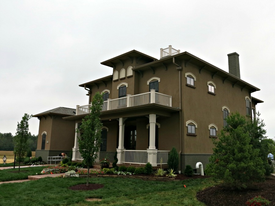
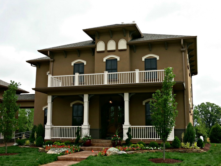
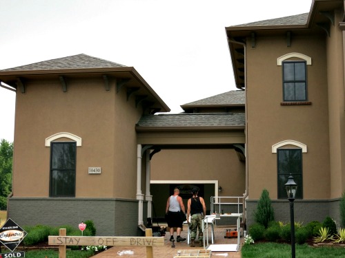
First, let’s get back to that Italianate. It is house # 12 on the official Parade of Homes flyer. It was built by Coppertree Homes, it has 5,650 square feet and 5 bedrooms. It only has 4-and-a-half baths, so someone has to share. It lists for $854,700.
It is a beautiful home. I only saw it from the outside, but it is definitely an eye grabber.
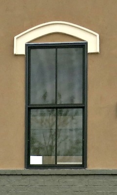
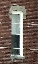
Here is why it looks like the real thing. Over each window you have these decorative arches. This was very common with Italianates and almost unique to this style of home. Below I show the window from the Coppertree home (on the left) and two from original Italianate homes in Ohio.
|
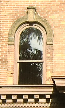 |
The window is flat across while the arch obviously is not, but I have seen this same thing done in Italianate homes and on Italian Renaissance style office buildings. It saves a little money, but it does so authentically.
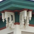
It has the brackets under the eaves that was the calling card of the Italianate home. These are a dull compared to those used back in the day, but it is typical of modern suburbia to suck the color out of historical styles and bring them into conformity with modern tastes.
 |
 |
The designer was careful to bring in exterior light from all sides as witnessed by the small windows on this side wall. The windows are sitting up high. You could see out them when standing up, but their main purpose is to ensure the light in the room is not coming in from just one angle.
An original Italianate would probably have windows that matched the front, and it is a little odd looking the way the small windows on the second floor look like they are higher than the windows in the front. It probably serves a good purpose inside, but the apparent lack of alignment is noticeable and disconcerting. I believe they are actually the same distance from the roof at the center point, but because the are narrower the are higher off the ground on the ends. Changing scales often create alignment problems like this.
My absolute favorite part of the house is the porte-cochère. That is a fancy way of saying a covered pass-through for a car. While the purpose is to allow you to drop-off passengers under cover, its beauty here is that it hides the garage. I write extensively on this in a series of articles on the garage problem, and mention the porte-cochère in my article on detached garages.
The little building on the left side of the driveway is probably a mini-garage for garden equipment or bikes and such, but I did not go back there, since there was quite a bit of construction activity underway.
Now for my gripe about this house. It has two features that were not done as well as they could have been.
First, there is a white balustrade around the small flat area at the top of the hipped roof. Balustrades like this were used the main roof on a lot of Federal style homes, and to some degree on Second Empire homes and on some Italianates. In some cases they were used to hide a roof, to make it look flat. In other cases they were actual railings for a walking area. In some cases they were just for show. This one is definitely just for show. Look at it in the first photo above. It is tiny. It not only serves no purpose, it looks like it serves no purpose. If you buy this house, take it down.
Second, the tower in the front part of this house is more of a stub. In Italy many of the estates had towers like this to provide a vantage point for watching the surrounding countryside. They were either called a campanile (meaning a tower) or a belvedere (meaning a beautiful view). When the style was brought to America it was altered somewhat, so an Italianate home is Italian to the same degree a deep-dish Chicago-style pizza is Sicilian. One thing that was kept was the inclusion of a viewing point, usually in the form of a tower.
This tower is more representational than literal. It has blocked in arches instead of windows, which you see in lots of buildings, but it rather misses the point of a belvedere if there is no view. While adding height to the tower adds cost, and you have to put a staircase in their somewhere, I think for $854,700 a tower ought to be a tower.
Still, despite my gripes I would enjoy owning this home almost as much as owning a real Italianate.
Craftsman Foursquare
Romanelli & Hughes
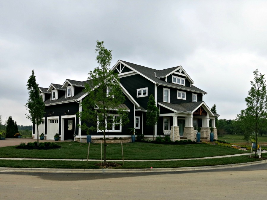
My next house I will look at, briefly, is this Craftsman Foursquare. The photo does not show it well, but it has some beautiful square shingle siding. I failed to get close enough to identify what type of siding it is, but who cares. It looks great.
They are saying this has a coastal theme. Shingles as siding are more common along the East Coast, so I guess I can see where they are coming from.
This is number 11 on the program. It was built by Romanelli & Hughes. It has four bedrooms and three full and two half baths. That should make four bathrooms, but that is not the way the math works. At $749,900 it is still out of my range, but getting closer.
It is on a corner lot, so it takes advantage of the to present the garage to a different street, so at least from a frontal view you can ignore the garage.
It has some nice Craftsman detailing on the front porch and at the gables. My favorite detail is the porch column bases. While these were standard fare for Craftsman homes these have a slight curve applied to their outer edge. It is a subtle point, but if this type of artistry in design is carried on throughout the house it should be a great house to own.
Craftsman Bungalow
3 Pillar Homes
This is a very traditional looking Craftsman Bungalow. You can find lots of houses that look like this in Ohio and across the U.S. and it is good to see builder's getting back to one of the great American home styles.
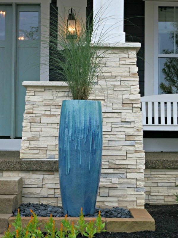
The field stone pedestals are unusually high. Typically the wood columns are 3 to 5 feet long instead of the 1 foot you have here, but there has never been a rule. Porch column structures is one of the ways that companies differentiate one house to another, and I think that 3 Pillar did an excellent job on this design.
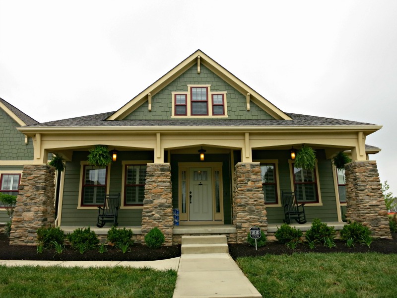
I would have loved to have gone inside on this one, to see if the interior is as Craftsman as the exterior. It isn't hard to make a Craftsman interior, because Craftsman homes had an open floor plan, which is the standard for houses these days.
As I write this I am travelling to Japan, which is why this is still an open question to me. I love a good Craftsman interior, but if involves exposed beam, which is easy, and old-fashioned joinery and lots of wood, which adds costs.
At 3,225 square feet this is bigger than most of the old stock of bungalows. There is a partially finished basement, which explains part of that extra space. At $508,400 it is on the less expensive side of the Parade of Homes.
This house is #1 on the official program.
Foursquare Colonial
3 Pillar Homes
You usually don't think of a Foursquare house as being Colonial, although the shape wasn't unknown in colonial times. It just wasn't the usual form and the Colonial Revival didn't mix the two. Foursquare's were usually Craftsman, or so plain as to lack any other defining description.
The Colonial comes into play with the fancy exposed lintels, the shutters, the small covered entry porch and the symmetry of the windows on the front.
It is a nice look but a bit boring in all white. Mind you I live in a boring white Foursquare farmhouse, so it is a very common look, but in this subdivision it becomes the dowdy maiden aunt of the group.
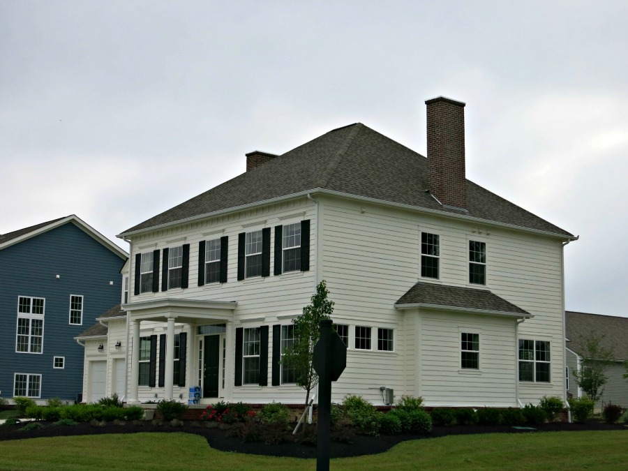
Though it is not obvious from this shot it again illustrates one of my peeves. The layout of the rooms is such that on the side facing us in this picture there is a front room, a middle room and a back room on the second floor. The middle room gets the two windows flanking the chimney. The front and back rooms have windows along one wall. That means each room suffers from light in only one direction. A bad idea as it causes deep shadows.
Rooms like this are uncomfortable. Adding two more windows would have solved his problem. For $544,500 I think the windows could have been designed in. Maybe that would take the price up $1,000, but it would be a better house.
I will be adding more to this page, but I am running out of day, so I will finish this tomorrow.
To Top of Page - 2013 BIA Parade of Homes Sneak Preview
To 2013 BIA Parade of Homes Contest
Home - House Design
Please!


New! Comments
Have your say about what you just read! Leave me a comment in the box below.