Frank Lloyd Wright Usonian Houses
A Look at the Rosenbaum House
The Rosenbaum house is a Frank Lloyd Wright Usonian house. So what exactly is a Usonian home, and how did one come to be built in Florence, Alabama?
A will give you a nice tour of the house, with lots of pictures, but first I want to look at Frank Lloyd Wright Usonian houses in general.
Origins of the Frank Lloyd Wright Usonian Houses
With the depression many of Frank Lloyd Wright’s wealthy clients were no longer in the market for building new homes. After some lean years Frank hit upon the idea of developing inexpensive homes for the mass market.
The Usonian home was Frank’s idea of what an inexpensive home should look like.
The same basic concepts that he used in designing mansions are found in these much smaller homes.
Characteristics of Frank Lloyd Wright Usonian Houses
Frank designed open floor plans built around a central, connecting space. In his early mansions this was the dining room. In Frank Lloyd Wright Usonian houses that central space is the kitchen. That same idea has come into vogue, with large kitchens becoming the central showpiece surrounded by the principle living areas of the home. With Frank Lloyd Wright Usonian houses this was a new and innovative idea, but the kitchens and the homes were small.
Frank believed rooms should be defined by their purpose and the elements required for that purpose, not their walls. He was fond of built-in functionality, with cabinets and many furnishings built into the design of the house.
In Frank Lloyd Wright Usonian houses the roof is flat. This was not an entirely new idea, but it was not common. Federalist style homes built in the early 1800’s often had a raised parapet around the roof that gave the illusion of a flat roof, but behind the parapet was a traditional inclined roof. In the 1920’s and ‘30’s some Art Deco homes sported flat roofs.
The advantage of the flat roof for the Frank Lloyd Wright Usonian houses was cost. Flat roofs used fewer materials.
Frank also eliminated the basement, building on a slab. This was not the norm in the 1930’s. This reduced excavation costs. It also provided the vehicle for distributing heat throughout the house, as he installed in-floor radiant heating, eliminating radiators in each room.
A Usonian home did not have air-conditioning. In many locations this worked out fine, because he designed the homes to have good cross ventilation. While he minimized the use of masonry with his use of panels, there was usually one part of the house built in brick. That plus the slab provided thermal mass to help regulate the temperature. Projecting overhangs kept the sun at bay during the hottest parts of the summer days while still allowing low winter suns to warm the house. In many ways Frank Lloyd Wright Usonian homes anticipated the passive solar homes being built today.
Frank Lloyd Wright Usonian houses were always one story. This eliminated the cost and space required for staircases. This makes sense where land is cheap, such as country homes or the distant suburbs. One story homes were not new, but he was ahead of the times. Within a few years ranch houses were the rage, but in the late ‘30s people still preferred building up.
Another innovation was the carport. This was Frank’s idea. A garage is expensive. Frank cantilevered the roof over a slab of concrete, giving much of the benefit at a fraction of the cost.
A Frank Lloyd Wright Usonian house could be built for around $6,000. The house came with its components pre-cut and ready for assembly. In many cases homeowners kept costs low by doing the construction themselves. Frank Lloyd Wright would send out an apprentice to supervise the construction.
He invented a special construction technique that used what he called Board and Batten panels. Fine wood finished the outside and the inside surfaces, but sandwiched in-between was a plywood core.
Design costs were reduced by using standardized design elements. Prospective homeowners would work with his staff to design what they wanted into their homes.
The interior and exterior walls were the natural color of wood. Large windows brought the views into the house. A garden location was designed as part of the layout of the house.
While the decoration was spare, even spartan, Frank Lloyd Wright Usonian houses always included a unique, repeating design element that made each house special.
The Rosenbaums build a Frank Lloyd Wright Usonian House
The Rosenbaum house was built in 1939. Stanley Rosenbaum was a Harvard graduate who came back to Florence to join his family’s business, running movie theaters in Alabama. With him he brought his young bride, Mildred Bookholtz Rosenbaum.
They originally lived with Stanley’s parents, but as a wedding present the parents deeded a property over to them that was conveniently located across the street, with a pleasant view of the Tennessee River. Along with the property came $7,500 with which to build a house.
In 1936 the first Frank Lloyd Wright Usonian house had been built for Herbert and Katherine Jacobs in Madison, Wisconsin. When Stanley went looking for advice he reached out to his friend Aaron Green, an architecture student. Aaron had heard about the Jacobs home and recommended that Stanley contact Frank Lloyd Wright.
The Rosenbaum house was only the second Frank Lloyd Wright Usonian house built, but it came just as interest was picking up for this type of house. By the time World War II started he had built 25 of his Usonian houses.
There was one major flaw in the construction of the home that would create problems down the road. The apprentice he sent out was supposed to ensure that the flat roof was constructed properly, but he took the term “flat roof” to mean it was perfectly level. As a result the water didn’t drain properly and years down the line much of the wood was ruined.
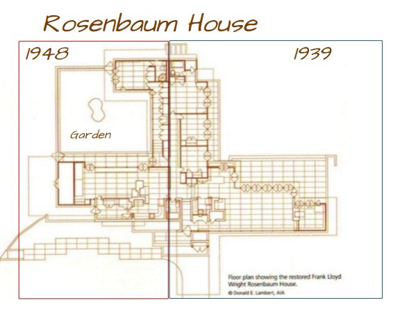
Originally the house was 1,540 square feet. This was perfect for a young couple, but the Rosenbaums did what young couples do, and soon they needed more space. Luckily Stanley was smart enough to go back to the original architect for an expansion of the house. In 1948 1,084 square feet were added to their Frank Lloyd Wright Usonian house.
The expansion added a much larger kitchen and a bunk room for the boys. An enclosed playground area was created, which later became a formal, Japanese-style garden.
The house remained with the Rosenbaum’s through the family years and past Stanley’s death in 1983. In 1999 Mildred sold it to the City of Florence with the understanding that it would be restored.
Today that restoration is complete. Guided tours are available on a daily basis. I was extremely lucky to get a private tour. I was even more lucky in that indoor photography was allowed.
Exterior of a Frank Lloyd Wright Usonian House
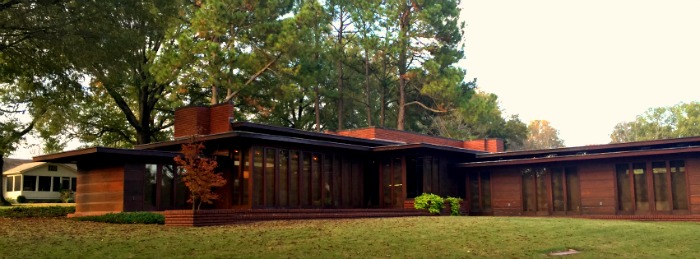
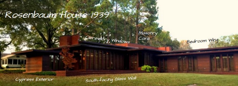
Looking at the Rosenbaum's Frank Lloyd Wright Usonian house from the rear we can see just how much light will flood into the house from its Southern exposure. Not only does it have walls of glass along the one side it has elevated clerestory windows bringing in light from above. Yet the wide eaves protect the house from the summer sun.
The bedroom wing has wood walls, for privacy. Throughout the house, both inside and out, the surfaces are cypress wood, which resists rot and mellows to a rich, dark, reddish brown.
From this side you can see that there are two masonry structures. On the left is a chimney for a fireplace. In the center is a central core. The wings appear to extend out from this masonry base. Visually the taller, heavier masonry structure weights it down, rooting it to the ground. Practically it provides a heavy mass that dampens temperature fluctuations.
The original structure ended about 4 feet to the left of the carport. Everything to the left of that was added in 1948.
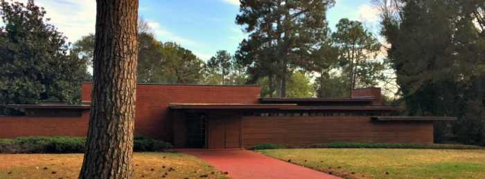
The front of the house has a different look. Where the back is all window the front looks more like a wall. The difference is intentional.
Light still comes in, from the clerestory windows, but the resident has total privacy. The downside is that the house has a very austere look from the yard. It is not what I would call "inviting".
On the right the structure is made of the board-and-batten panels. On the left it is masonry. The red walkway you see is actually a driveway. The projecting eave in the middle is actually a very long cantilevered roof that forms a carport. You can see it better in the side photo.
The far left of the house is cut off in this photo.That also has a carport with a curved, pass-through driveway that provides easy access to the kitchen.
If you look carefully you can see a slight difference in the color of the brick just to the right of the tree. This is the dividing point between the original 1939 Frank Lloyd Wright Usonian house and the 1948 expansion.
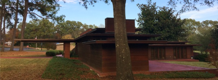
This side view is strictly of the original house. Nothing of the expansion can be seen from this angle.
The cantilevered roof of the carport is striking from this angle. Nothing like this was seen on other houses of this era.
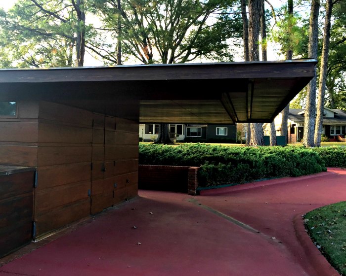
The expansion also added a new driveway. There is a side door to the house just past this wall. You can see the walkway that leads to it. The double doors here lead to some storage. Evidently even a Frank Lloyd Wright Usonian house needs a place for the lawnmower and such. When it comes to storage Frank was very practical.
Entering the Frank Lloyd Wright Usonian House
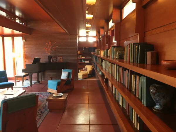
This is the view when you enter the Rosenbaum house through the front door. The living room is immediately in front of you, with a small study on the other side of the brick wall.
The furnishings here are the same furnishings used by the Rosenbaums. Mrs. Rosenbaum replaced some of Frank's specially designed chairs. Frank Lloyd Wright designed furniture for all of his houses, but his clients weren't always in agreement with his ideas on comfort and looks.
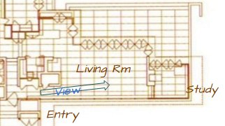 This map shows the position of the camera and the viewing angle of the previous photo
Mildred Rosenbaum was a concert-worthy pianist in her pre-Stanley days, so a grand piano was always part of plans for the house.
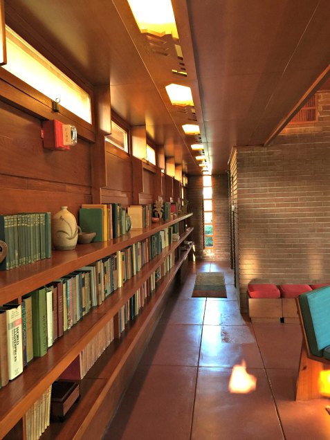
Note the book shelf. This is the first of many built-ins that Frank Lloyd Wright included. I find the notched vertical studs very interesting. Even his structural elements are works of art.
If you look at the ceiling you'll realize that there is a raised center section, which allows for clerestory windows to bring in light from above.
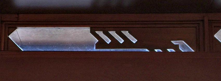
A closer look at the clerestory panes reveals this strange design element. Frank Lloyd Wright created a unique motif for each Frank Lloyd Wright Usonian house. This motif is found in other design elements throughout the house.
Look closely at the photos in this article and you will realize that Frank built in a lot of recessed lighting. Look at the lights and you will see a cover in this same pattern.
The Rosenbaum Study
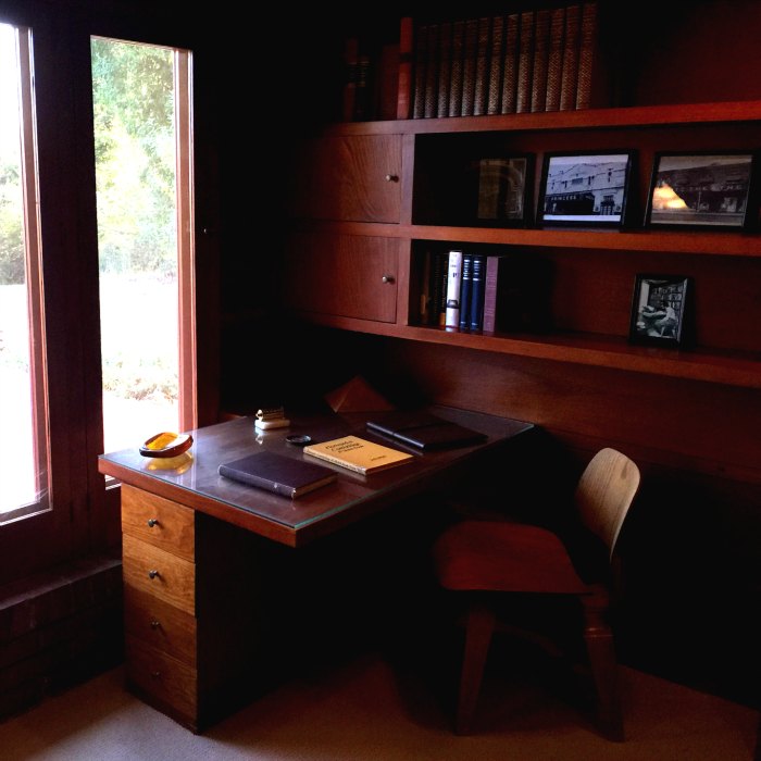
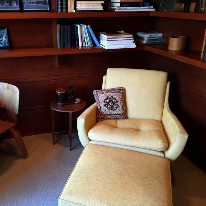
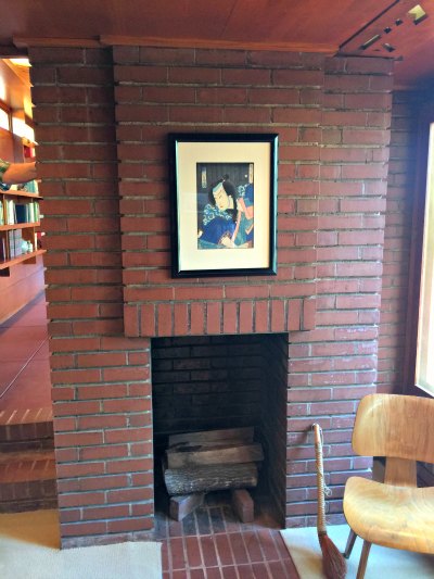
Past the living room is a small study. Despite the lack of a door it gains privacy from a large chimney/hearth structure that blocks off the living room. Here are three photos that take in most of the study.
Note how the rich cypress brown, seen in the wall, the shelves, and the desk, dominates the room. Its all just background, but it provides the house with a natural feel lacking in most of the ranch homes that echoed this layout.
The shelves, the cabinets and the desk are all built-ins. To Frank Lloyd Wright it wasn't the walls that defined a room but the things in it that gave it purpose.
The fireplace not only provided a large mass to help stabilize the temperature, but the chimney helped provide a draft to cool the house on those hot Alabama summer days.
In this case it also serves as a wall separating the study from the living room.
Frank reduced costs by avoiding having exterior walls made from masonry, but he valued the benefits too much to lose it entirely. A large hearth like this gives a sense of weight and solidity to a home and the earth tones of brick will generally go well with the earth tones of wood.
Frank Lloyd Wright Usonian houses generally had this same mix of board and batten walls with large masonry hearths.
The Rosenbaum Living Room and Dining Room
If you leave the study and stand in front of the piano, you get the view below. Like the study, the living room has its own hearth.
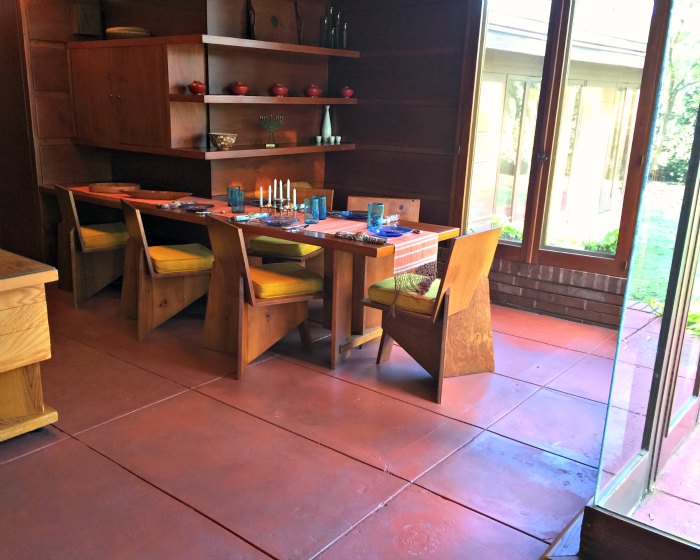
Beyond the bricks is the kitchen. To the right of the brick area the glass wall bumps out to form an informal dining room. Or perhaps it forms a formal kitchen nook.
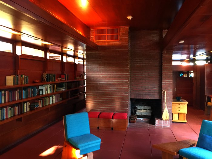
Like the rest of the house it has its share of built-ins. The dining room table is attached to the wall. At the end of the table a cabinet is available for holding the dining room dishes. Shelves line the wall of the bedroom wing which intrudes into the dining room space.
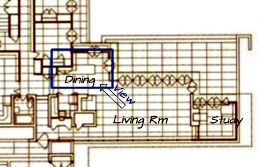
In a sense the dining room is situated like a hinge between the social wing and the bedroom wing. The way that Frank includes the corner of the bedroom wing in the design of the dining room is quirky. Filling that little bit of space at the end of the bedroom intrusion with a cabinet and moving the table to the center of the open space would have been a safer, more traditional way of handling this.
Yet, despite its odd layout Frank's solution works. His tying the furniture into the wall prevents a lot of changes by the homeowner, so to some people this would be a bad idea. But for Frank Lloyd Wright the furniture was a part of the house. That table was what defined that space as a dining room. Without it that space could be anything.
The chairs are not built-in, but they are Frank Lloyd Wright chairs. Plywood was a new material and Frank experimented with plywood furniture.
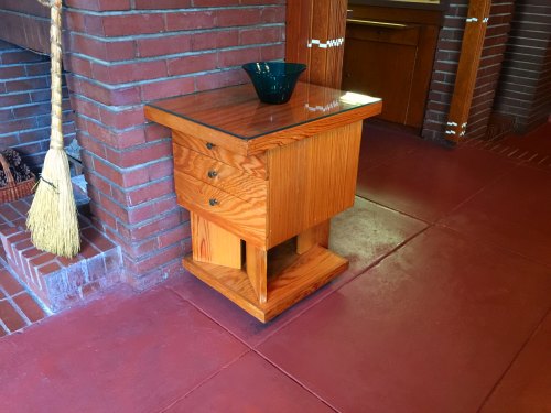
Across from the dining room table is this Frank Lloyd Wright end table. I don't think it belongs there. It seems an odd place for this. Most likely this belongs next to a couch. In this photo you can clearly see that it is made out of plywood.
Just behind that end table is the entrance to the kitchen. You can see the accordian hanging doors that were used to close off the kitchen. Which leads us to our next topic.
The Kitchen and Bathroom
Within the brick core that forms the corner of the original house you have the entrance, the kitchen and a bathroom.
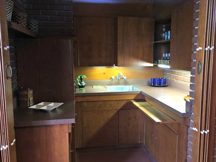
The original kitchen was tiny. He was trying to keep the house inexpensive, but I bet he lost more than one sale to a housewife who said "there is no way I am cooking in a kitchen that small!"
There is no icebox or refrigerator in this kitchen. I assume there must have been some accommodation for cooling. Perhaps the icebox was in some space that got altered when the house was expanded.
In the 1905 Westcott house I saw an icebox with an exterior door, so ice could be added by the delivery man. That house was more like a mansion, so I can see where this house probably didn't have that feature, but there must have been some place to keep food cold. Unfortunately you will have to find out that out from someone else.
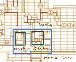
Between the kitchen and the bathroom there is a hallway that leads to the entrance.
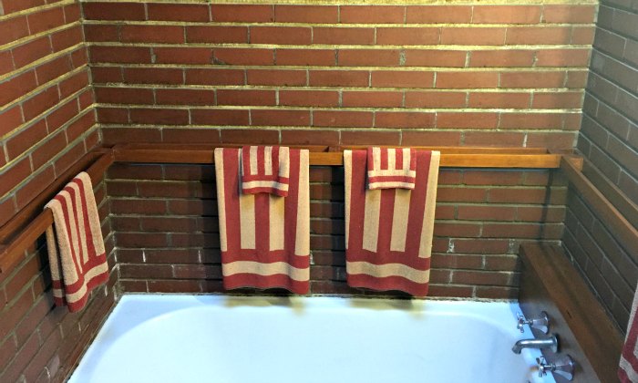
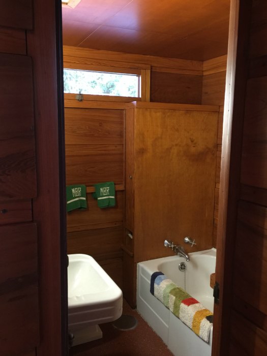
Like the kitchen the bathroom is surrounded with brick. I suspect there is a practical reason for both of these. For the kitchen brick is safer, because of the risk of fire. For the bathroom brick is better because it won't warp if the room get steam.
Unfortunately I do not have a good picture of the bathroom, other than this close-up of the bathtub. As I recall there wasn't much room for me to get a good photo.
I thought the bathroom was neat because of his careful consideration of the needs of the bather. He has surrounded the bathtub with towel racks. This seems like a good idea and yet strangely it has not caught on.
The Bedroom Wing
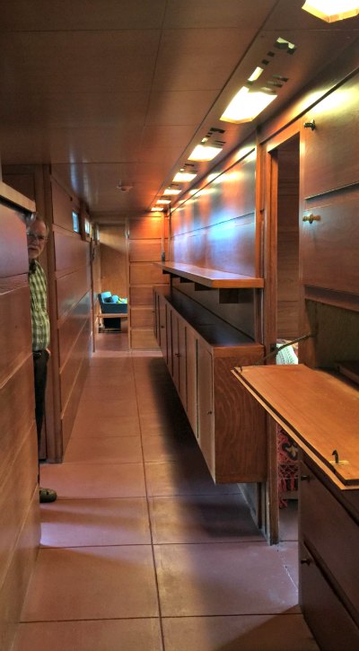
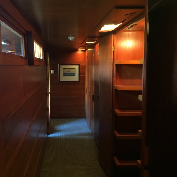
The bedroom hall was a bit of a surprise to me. It is lined with storage. On the one side you have the board and batten panels, and on the other built in cabinets backed by the board and batten panels.
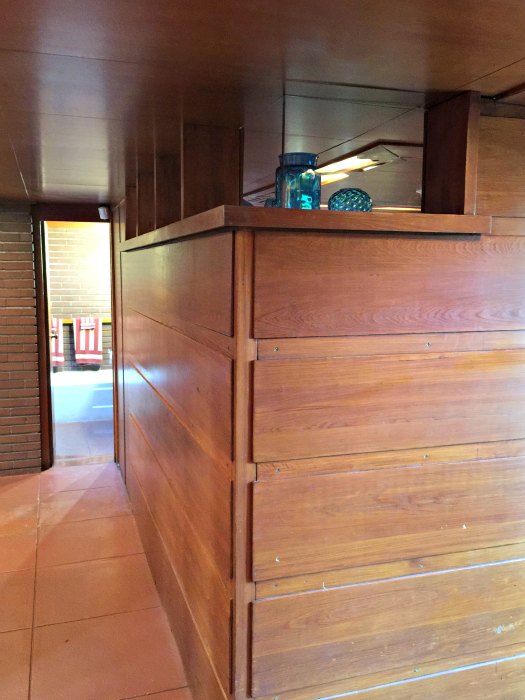
In the picture on the left above my tour guide is standing in a hallway that leads to the addition. In picture on the right the place where my guide was standing is in the lower right corner of the picture. This picture looks back up the hallway to the bathroom. Everything behind those panels on the right is part of the new addition.
It is well lit, thanks to recessed lights and clerestory windows.
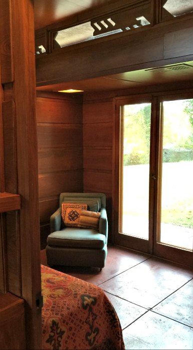
The bedrooms are relatively small. Frank wasn't a big fan of big bedrooms.
I have a few pictures of bedrooms. I do not remember seeing any dressers in the bedrooms and do not have any pictures of them. I suspect that the storage in the hallways was intended for storing of clothing.
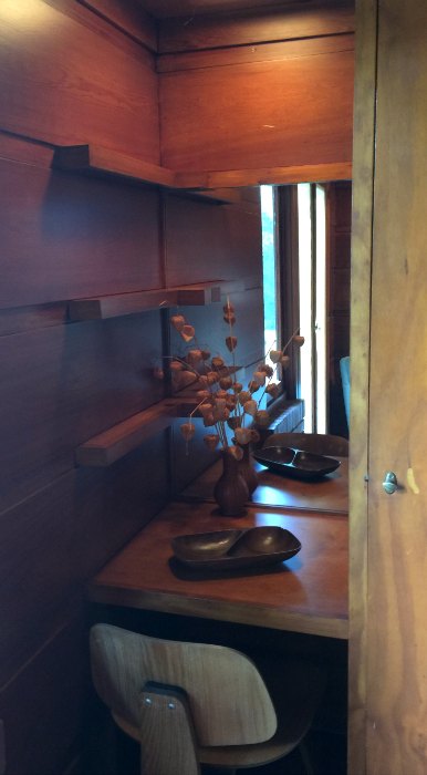
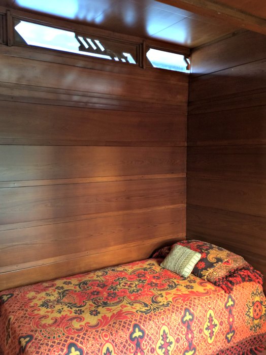
Each bedroom does have a built-in desk or vanity, depending upon how you used it. They also have built in closets.
There are two small bedrooms in the original bedroom wing, plus a master bedroom. The smaller bedrooms are 10'x12' but two feet of that is taken up with the vanity and closet, so you effectively have a 10 foot square room.
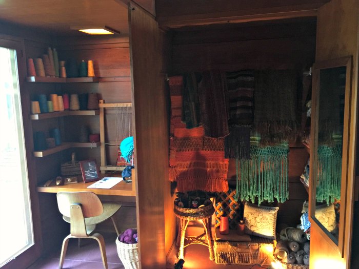
The photo immediately above is of one bedroom that was turned into a work space for Mildred Rosenbaum. In her younger years she was a fashion model whose photo graced the cover of Vogue magazine. She was a conservatory trained pianist who could have made her living as a musician.
In her later years she turned her hand to weaving textiles. As with her earlier occupations she did all things well. She developed a reputation in this field and many of her works were sold through the group that continued promoting and selling Frank Lloyd Wrights many designs.
This bedroom is where she engaged in weaving and the open closet door shows some of her handiwork.
At the end of the hallway is a master bedroom with its own bathroom.
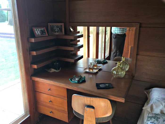
The bedroom itself is 12'x14'. Out of that a closet and a vanity take up about 16 square feet, but there is additional storage space. At one end of the room is the bathroom and some additional cabinets
This bathroom has a bathtub, but the bathroom is very basic and small.
In the master bedroom the vanity isn't as confined as in the smaller bedrooms. The closet is not next to it and it spreads out a little wider.
The bathroom above is about 6'x6'.
He was trying to keep costs down, and the age of the master suite with spacious bathrooms and whirlpools was still about 50 years away.
The 1948 Addition to the Frank Lloyd Wright Usonian House
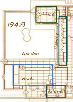
With the expansion in 1948 the Rosenbaums gained a much bigger kitchen, a room next to the kitchen with additional cabinets that may have been used like a household office, a bunkroom, a separate office, and a large enclosed space that they used as a playground.
To put this in perspective, the Rosenbaums had 4 boys by this point. The eldest was seven-years old. The youngest was just one-years old.
The separate office had its own small bathroom with a shower. This must have helped unclog the bathrooms some, but it doesn't seem very convenient for the boys.
To add this to the existing structure Frank expanded the central brick core, and added a hallway alongside the existing hallway.
This expansion hallway is right next to the original hallway. As before there is lots of storage.
This hallway does not block light to the older hallway because it has a lower roof. The original hallway is taller. Frank used multiple roofs of different heights to allow in natural light even into interior spaces.
Take a left at the painting and you get to the office. When I was there the room was filled with architectural drawings. Perhaps I felt awkward taking pictures in there. Whatever the case I have no photos to show you, except one of an even smaller bathroom. I shall spare you that joy.
Remember when I showed you a photo of the hallway looking back to the bathroom and I said that on the other side of that wall was the expansion? Well this is what was on the other side of that wall.
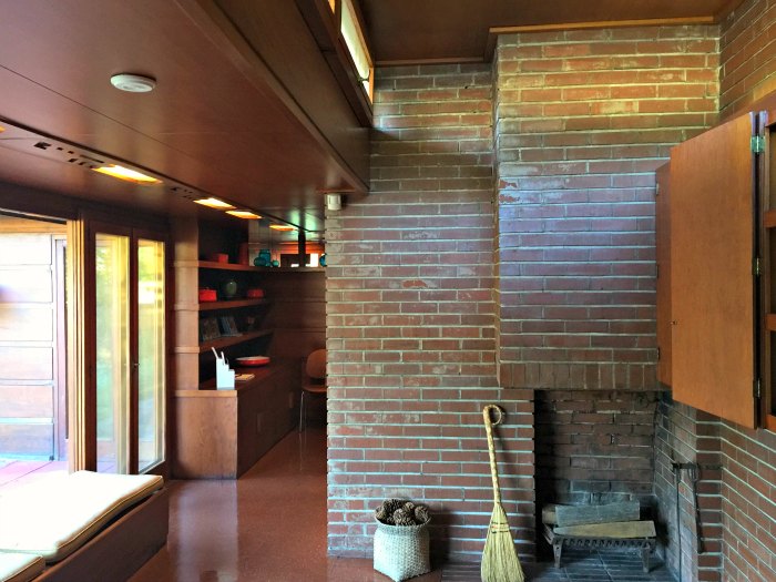
I am not quite sure what the purpose of this room is. It is really part of the same large room that includes the bunk room, but there is a brick hearth that separates the two sides of the room. The hearth provides some privacy, but there is no door between the two sides of the room.
This little sitting room, or whatever it was, is about 10'x8'. On one side is the garden/playground, and on the other the entrance to the new kitchen. Perhaps they used this area as a breakfast room.
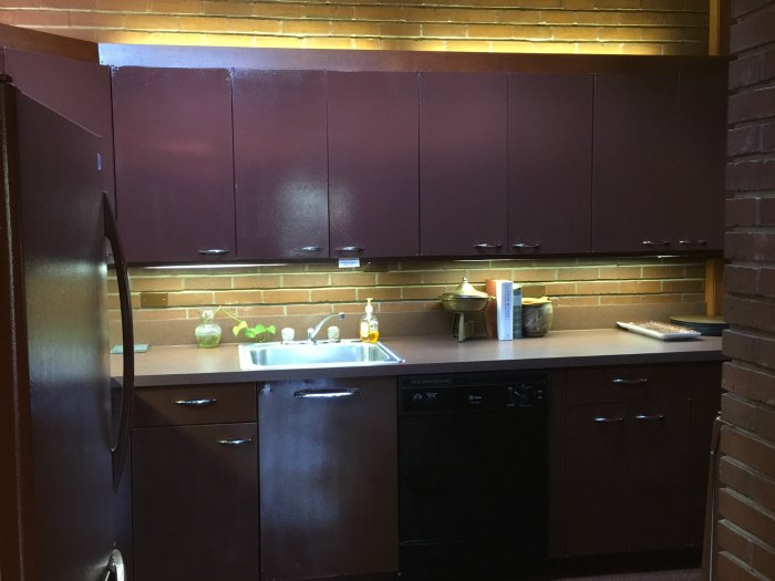
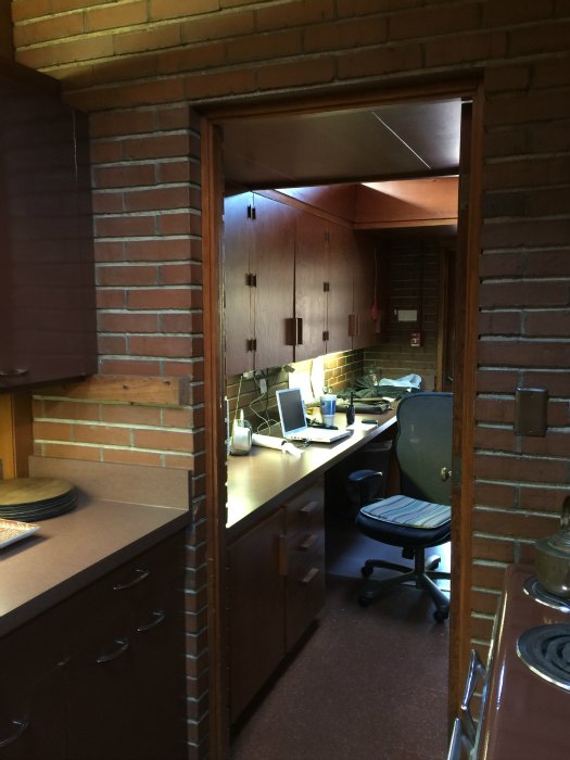
The new kitchen is built within the expanded brick core.Its basically a straight-line kitchen but the opening on the side allows it to form a little bit of an L.
It still doesn't come up to modern standards but its workable. The previous kitchen was small even for a couple.
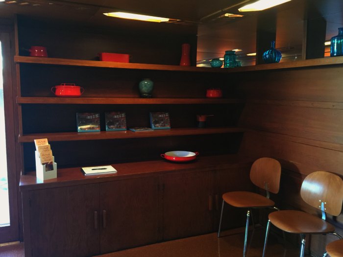
This is what I meant by a room that might have been used as a household office. That is its current use, as the organization that hosts the tours of the Rosenbaum House use it for administrative purposes.
I do know know its original purpose.
The door at the end leads to the carport via a small corridor.
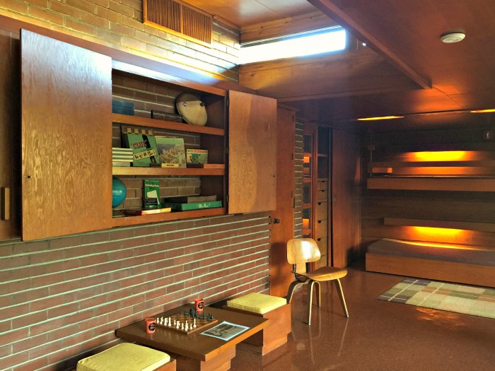
This is the bunk room. It is a large room, although the beds are small.
Its about 20'x10' excluding the bunk area. The bunks seem long, so maybe all four boys were in here at one point.
I don't see quite enough storage space for four boys, but I suppose there is enough for two boys. It is a play room as well, so probably all four were often in here, no matter what the sleeping arrangement were.
On one wall was a large picture window overlooking the playground.
In this view from the bunk area you can see just how open this room is. To make the room dark when it was time for bed Mildred would have had to close down the kitchen and the "breakfast room".
I don't know how often they used the fireplaces. The floors were heated. I would have enjoyed a fire in my bedroom, but I suspect that most parents would not like this idea.
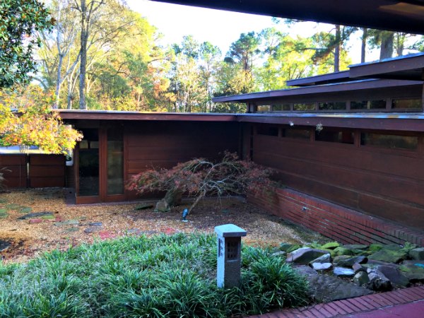
I will close with a view out the boy's bunk room to what is now the garden. Back in the day it would have been strictly for play.
This also provides an excellent view of the many layers of flat roof that allowed Frank Lloyd Wright to bring natural light in throughout the house.
Top of Page - Frank Lloyd Wright Usonian Houses
To Home - Residential Architecture
Please!


New! Comments
Have your say about what you just read! Leave me a comment in the box below.