Handicap Accessible Homes
Testing the Possibilities of Accessibility and Sustainability
Universal Design, applied to residential architecture, creates handicap accessible homes that are a joy to live in for all residents. Universal Design is a framework for the design of living and working spaces and products benefiting the widest possible range of people in the widest range of situations without special or separate design.
This is being tested out at the Universal Design Living Laboratory in Columbus, Ohio.
A living laboratory sounds a bit anti-septic, but this is a real house with real people living in it. It is the brainchild of Rosemarie Rossetti and Mark Leder. This husband and wife team had their life plans take a sharp turn when a tree came crashing down on Rosemarie, severing her spinal cord and leaving her paralyzed from the waist down.
That was in 1998 so Rosemarie has some experience under her belt in adapting to the world around her. They conceived of this project as a way of testing the limits of what could be done to make the home a more accommodating place for someone with physical restrictions.
The lessons they have learned can be applied to many different situations. Most people are not going to become paralyzed, but many people will get older, and the same innovations that make life easier for Rosemarie will make life easier for them.
Handicap Accessible Homes - A Quick Overview
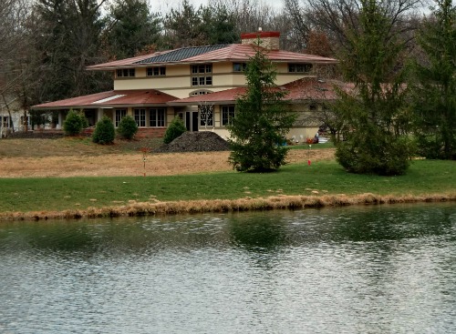
The 3,500 square foot prairie-style home has their living quarters on the first floor, while the basement will hold training seminars, a workout room, and the household utilities. As I write the first floor is mostly complete and quite livable, but the basement is largely unfinished.
There is a small balcony area on the second floor, a perfect spot for a quite reading hideaway. Otherwise the second floor is really just open to the first floor, allowing clerestory windows to provide ample light to most of the home.
Not satisfied with proving out the benefits of handicap accessible homes of a universal design, they have also made the house a showcase for sustainable architecture. Most the water drains off the roof into an underground catchment which supplies a small waterfall, and provides for those dry periods, such as the Midwest experienced this past summer.
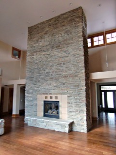
Thin film solar panels on the south-face of the roof provide power for the home. Six-foot-wide eaves prevent excessive solar gain in the summer. Large windows on the southern-exposure allow for solar gain in the winter. A large cultured rock chimney provides mass to regulate the temperature and also provides for circulation between the floors.
A Word About Our Sponsors
It takes a team to build a house this nice. In this case both Leder and Rossetti served as the general contractors, something neither one of them had done before.
Their designers were Patrick Manley and team at the Manley Architectural Group, which specializes in Universal Design and Handicap Accessible Homes.
I won’t go into all the details of their team. They address that on their website. Suffice to say that they enlisted a lot of help in bringing their dream to fruition.
Since it was to serve both as a model for handicap accessible homes and as their own, private home they paid particular attention to the materials used. They wanted a well-built home as well as an accessible home. They scoured the market for the best products they could find and then went about enlisting corporate sponsors. We will take a close look at many of these products as this series of articles unfolds.
Part of the purpose of the UDLL is to test out the available products that can be used in handicap accessible homes. Since Mark and Rosemarie put so much research into their choice of materials and products it makes sense learn from their research, so at times this series of articles will take a closer look at the products and technologies and manufacturers used in their house.
The Layout
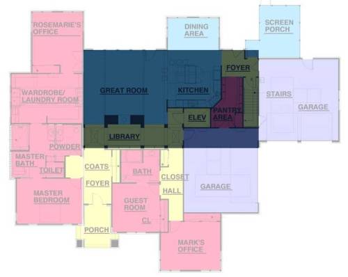
The house consists of a two-story rectangular block with multiple one-story wings. The wings surround this central block except at the south wall of the living room where windows from top-to-bottom flood the room with sunlight.
On the east side a wing covers the master bedroom, the master bath, and the laundry room / wardrobe. A secondary wing extends south, covering Marie’s office. On the opposite corner of the house a similar wing extends north for Mark’s office. Off to the west one wing covers a two-car garage, but it is not the only garage. Another two-car garage is built into a wing that covers the front of the house on the north.
This is the floorplan of the first floor. I have highlighted the two-story portion in blue. I have masked off the wings with a slightly transparent white. The north of the house is at the bottom. The patio area is at the top of the drawing, just beyond the Great Room.
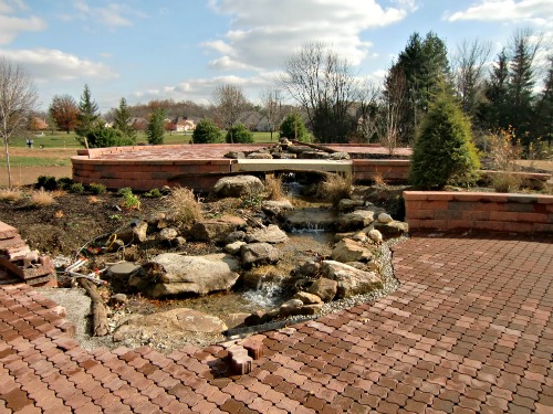
The dining area is another little bump-out from the south wall. This dining room and Rosemarie’s office serve to bracket a large porch area that projects out beyond the house to include a mound with a watercourse running towards the house. A wheelchair-accessible trail runs to the top of the mound.
When I visited the mound and porch were nearly complete, with only a few plantings remaining, but it had that young, just planted look. It was winter and nothing was in its glory, but you could tell that the garden was going to be quite spectacular in its season.
Handicap Accessible Homes - Accessibility and Aesthetics
Before I get big into the accessibility aspect of this house, lets talk aesthetics.
There are two basic influences to this house. First, in shape and silhouette it is a Prairie style home. Frank Lloyd Wright developed the style, but many others copied it. These were usualliy two-story homes, but with a strong emphasis on the horizontal. Roofs had a shallow pitch, but had large, projecting eaves. This made the roof line somewhat wider than the body of the house and helped accentuate the horizontal.
The second influence is the Craftsman ethic. I won’t go so far as to say that it is a Craftsman house. It lacks the exposed beams and some of the structural details that you would find in a Craftsman style house. It is in the woodwork that I see the Craftsman influence. The molding is wide, but simple. There is an abundance of built-in cabinetry. It is all very well done.
It reminds me of the woodwork in my house, which was built in 1906. There were a lot of houses in that era that didn’t go the full Craftsman route, but borrowed heavily from its use of wood and the simplicity of its forms.
That said this is no reproduction house. The house borrows from other styles along the way but integrated them nicely. The light fixtures have a certain 1960’s chic about them, but blend in perfectly with the decor. The clean, spare lines in the living room remind me of European houses with a Scandinavian influence. The brushed stainless hardware on the cabinets and pull-outs have a contemporary look.
The overall effect is simply a well-designed house, with careful thought put into the blending of textures and the proportion of the various parts.
The house is dominated by wood, stucco and earth tones. It has a very natural feel about it. The abundance of natural light adds to this sense of working with nature rather than against it.
It reminded me of the rooms in Japanese houses where they cover the floor with tatami mats. These are thick, woven, grass mats which give the rooms a hushed feel, and a comforting, clean smell of cut grass. I can’t think of why that memory comes to mind except that somehow, without a lick of tatami, they have manage to recreate very similar sensations.
The Story Continues - Elsewhere
So far I have focused on the look and feel of the Rossetti Universal Design Living Laboratory. As this article continues on the next page I will explain what makes this a model for other handicap accessible homes.
To Side Opening Oven Manufacturers
To Wheelchair Platform Lift vs Elevator
To Rainwater Collection Systems
Please!


New! Comments
Have your say about what you just read! Leave me a comment in the box below.