Architectural Balance

Balance, in design, is the distribution of those things that attract the eye. With architectural balance this primarily means mass, but there are other characteristics that come into play that can affect balance.
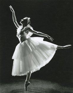
Man is designed to operate in balance. We adjust our weight and position constantly to achieve this. It is what seems right to us. When we see things that are out-of-balance it sets us on our guard. It is hard to be at ease in such a situation.
In painting the artist will generally try to achieve balance, but it is a two –dimensional world he is operating in. If he is painting realistically the implied mass of the objects is important. That is we can understand that a fat man off to the side will seem out of balance if the only other figure is a skinny man near the center. If the painting is abstract mass might be irrelevant, but he still has color, texture and shading that he can manipulate to achieve the same effect.
Architectural balance can be achieved through symmetry. We can have a mirror image about a central axis. In architecture this is common. It was the norm for classical architecture.
That symmetry can also be radial. While this is uncommon for a house looking at an elevation view, you can have radial symmetry from above, from the plan view. I live in a foursquare. Its basic shape is a square so it is radially symmetrical. However, other than for a few people flying over in balloons this is unlikely to be noticed.
You can also have a near or approximate symmetry. Here there is no mirror image, but the masses placed on one side of the axis are roughly copied on the other side. There may be side extension that is different than its cousin on the other side, but they are of similar shape and size.
Finally, you can achieve an asymmetrical architectural balance. This is more difficult to achieve. It can be a more interesting view, but a failure to achieve this can lead to a situation where the individual elements look right, but the combination seems awkward.
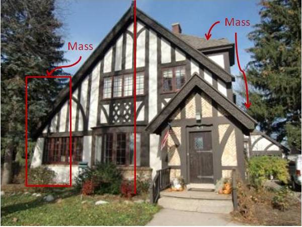
Consider the half-timbered house below. It has a gable on the right projecting out to the side, and it has the entrance porch projecting forward, also on the right. To balance this house the architect extended the house out to the left. There is additional mass on the left for the main part of the house, to balance out the additional mass of the projections that have been applied on the right. Furthermore, the main windows on both floors are off-center. They are off to the left. Of course a window doesn’t really add physical weight to the left side, but it does add visual weight. The net effect is an asymmetrically balanced house.
The same effect can be seen with texture on a house. Most houses have a fairly uniform texture so it is not a big challenge. However, if you have decorative shingles providing interest you need to make sure that you don’t overload one side of the house with texture and leave the other side bare.
The same thing can be said of windows. Based on the interior room arrangement you may not need windows in a certain section of the house, but you don’t want to have a dozen windows on the left and one on the right. Or, having this situation, you then need to provide some counterbalancing weight. If it isn’t going to be windows you need a substitute. The problem is that you need something that will approximate the windows in color and size. Sometimes it is just better to add a window that doesn’t need to be there from a functional standpoint.
Unless yours is a townhouse, you will need to consider the view of the house from several vantage points, and it is likely that you will not achieve architectural balance in all of them. We don’t always look at a house while centered on the door. Sometimes we see it from afar while coming down the road.
Years ago I lived in a neighborhood that had some houses with very nice fronts, but on the sides and back they just put up the windows all higgledy-piggledy. The windows were conveniently arranged for the interior, but offended the eye for a host of reasons on the outside. One of those reasons was balance.
To Top of Page - Architectural Balance
Return to Architectural Concepts
Home - House Design
Please!


New! Comments
Have your say about what you just read! Leave me a comment in the box below.