Art Deco Architecture
The Art Deco movement covered all the decorative arts. Art Deco architecture took advantage of this innovation in style to create buildings, bridges and homes with a modern look.
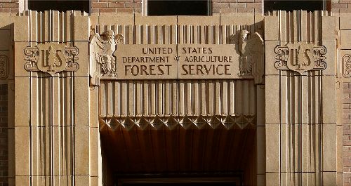
Art Deco architecture was basically nonexistent until after the 1925 exhibit celebrating the 25th Anniversary of La Société des artistes décorateurs. It was billed as an exhibition of all that was new in the arts from around the world.
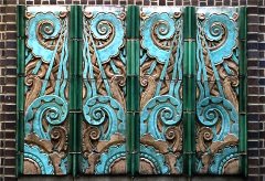
It must have been heavily promoted as it seems to have attracted architects from around the world.You can find a handful of structures pre-dating 1925 that are billed as Art Deco, but remember, this style was just a metamorphosis of the Art Nouveau style. Some architects were designing under the influence of Art Nouveau and some of these naturally migrated in the same direction as the rest of the art community.
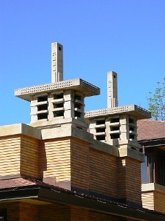
Some had even made the jump early. Frank Lloyd Wright was using Deco-style geometric designs well before the exhibition. You see it in his stained glass windows and in some of the detailing on his Prairie style homes.
Starting from about 1928 the seeds planted at this exhibition bore fruit. There was an explosion of Art Deco buildings appearing all around the world, and it was these buildings that got the attention of the press. They were new and daring, reviled and loved.
This continued through the 1930’s. In the 1940’s Streamline Moderne took over, and this had much of the design aesthetic of Art Deco. However, it was at the end of this period that the International Style took off and this effectively closed off the Art Deco era.
That is the condensed version of the history of Art Deco in Architecture, but it doesn’t enlighten you much as to what it looked like. For that we have the pictures below, a collection of photos from the internet plus a few of my own.
On this page I have focused on buildings. To see how the style translated into single-family homes please visit my page on Art Deco houses. You can get there by clicking on this Art Deco house icon.
What these pictures won’t do is give you an idea of why these buildings looked the way they did. The architects of that day could have taken this several different directions. Indeed, there is considerable variety within Art Deco architecture, but it tends to move in one direction, towards simplicity, towards a cleaner, purer palette. Why did it go this way?
As I touch upon in my Art Nouveau Architecture article, architects were looking for something new and modern and completely different from the Classical and Gothic models. New materials made it possible to build without the constraints of stone. Spans could be greater, windows could get bigger, and the only limits to the height seemed to be the sky. The old classical models didn’t seem to fit the new possibilities.
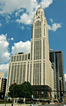
But there was a difference with Art Deco architecture. Art Nouveau happened in the infancy of skyscrapers. With Art Deco the construction of skyscrapers was moving into its adolescence. There was already a history of building structures hundreds of feet high. Louis Sullivan’s pioneering work was now a generation old. The idea of building without columns and arches was beginning to seem normal. A building was beginning to be thought of as a structure with a skin.
At the same time you had some outside forces constraining buildings in new ways. As the early skyscrapers went up people started to realize that cities were in danger of evolving into dark canyons, where light never reached the streets below. Building codes started to address this, and the usual way was by requiring setbacks. This meant that very tall buildings had to get narrower as they got taller. This allowed light in, past the buildings and into the street. Thus a lot of Art Deco skyscrapers have a very wide base, progressively stepped in towards the center, and culminate in a single, tall tower.This wasn’t an Art Deco innovation, it was just a coincidence of timing.
|
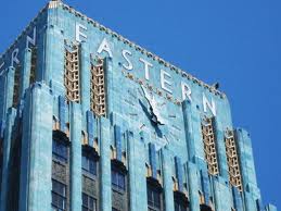 |
You also had some experimentation going on with color. There is nothing that prevents an architect from building a classical style building and going wild with the paint brush, but with exteriors tradition and materials tend to mute the palette. People feel like these building should look like marble or granite or brick. When architects began to free themselves from the models of the past some also managed to think beyond the soft, natural colors of the past. Especially in retail spaces, where a little advertisement is always helpful, we sometimes find vibrant colors integrated into the building’s design. We saw some of this with Art Nouveau. We see more of it with Art Deco. Still, these were the exceptions. Most Art Deco buildings have a color scheme that would fit into any era that preceded them. |
As I mention in my paper on Art Deco, there were a lot of influences from archaeology effecting the designs of artists from this period. King Tut’s tomb was discovered, and all things Egyptian were popular. Discoveries in Central America brought Mayan designs to the attention of the art world.
Since these
were inherently architectural elements it was natural for the architects of the
period to include these influences in their buildings. Click on the icon to the right to
go to a page devoted to these archaeological influences on Art Deco architecture.
However, don’t think that all Art Deco architecture was bold and daring. There is a considerable amount of building that went on that followed along classical lines, but with Art Deco embellishments. A government building might still be ringed by columns, but with Art Deco-inspired capitals and decorations.
In part,
thanks to the New Deal and the Works Progress Administration (WPA) there were
quite a few government building projects in the 1930’s and many were as I
described, classical with an Art Deco twist. Click on the icon with the pillars for a page of Art Deco
Classical buildings.
So, all these forces worked together and the architects of the period created what you see on these pages. Some are garish, overdone and obtrusive. Many are lovely and pleasing, interesting and challenging.
When I see these buildings, and I compare them to the tall boxes of the International Style, or the concrete behemoths of the Brutalist architects, I become convinced that we use the term “progress” too freely. It is progress if things get better, and unfortunately they did not.
Change is a funny thing. Maybe it isn’t always forward, but even our regressions can influence us positively. The dark ages may have cut us off from our classical past, but they introduced us to the Gothic. The International Style may have been a scorched earth on attack on ornamentation and decoration, but it gave us a blank canvas on which to begin anew. Architects are once again attempting to create buildings that both delight the eyes and perform their intended function.
Sometime in the future their will yet be a new look, a new style, that will inspire a new generation of architects, and eventually we may yet see such a style develop the legs that allow it to hang around, not for 15 years, but for many hundred, until it too becomes the accepted norm by which all others are judged.
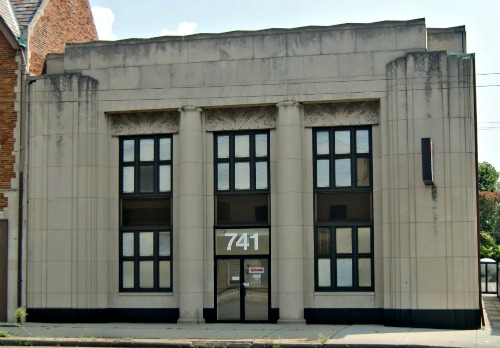
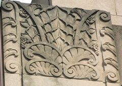
This is the Central Assurance building in Columbus, Ohio. The sides look new and (1930's) modern but right in the middle you have classical pillars. It was not uncommon to employ a mix of the old with the new in Art Deco architecture. Note the stylized take on classical designs in the window header below and the tile to the right. |
|
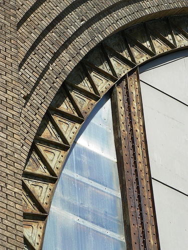
Though it has been neglected this is the prettiest I-beam I have ever seen. It is on the Art Deco Central Terminal in Buffalo, an abandoned railroad terminal that is scheduled to be renovated.
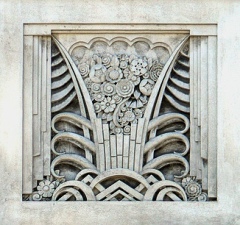
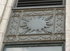
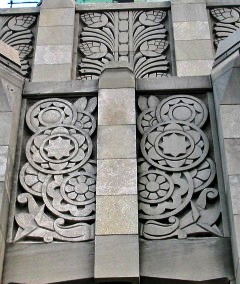
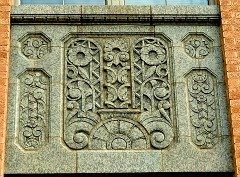
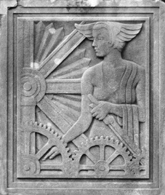
Art Deco architecture frequently used low relief plaques or tiles to provide the decorative detail. These might be carved in stone, but were often cast concrete or terra cotta tiles. Art Deco architecture had a wide range of styling options. Modernized versions of traditional classical floral patterns were commoon, but so were themes befitting an age of technology, as with the mechanic on the lower right panel.
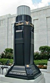
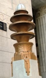
Sometimes it was easier to go wild with the things that go along with a building. The two outer lamps here adorn the old Ohio Supreme Court building, which is mostly classical with an Art Deco twist.
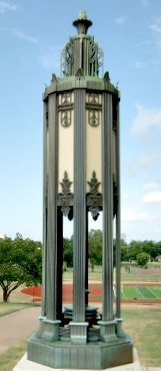
The center lamp is at the very Art Deco Will Rogers High School in Tulsa, Oklahoma.
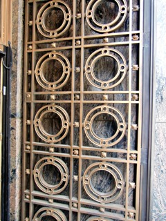
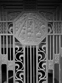
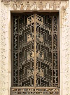
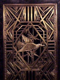
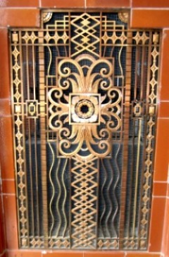
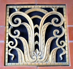
Any kind of metal work - grills, gates, balustrades, railings - were an excellent opportunity to let the graphical nature of Art Deco shine through.
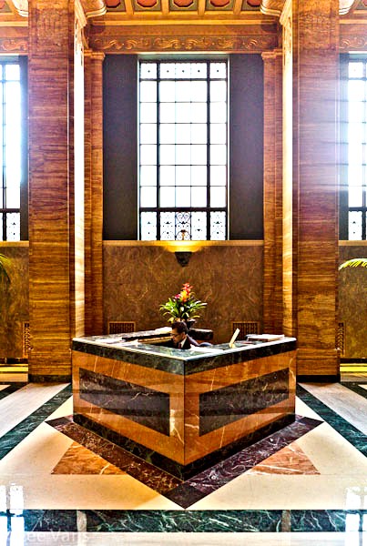
This lobby shows the strong geometric focus that was typical of Art Deco and, to a lesser degree, Art Deco architecture.
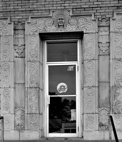
The little curlicue things surrounding the door are called volutes and they are commonly used in Classical architecture. This courthouse is decidedly unClassical, but the architect went crazy with the volutes. For some reason volutes are a favorite with Art Deco architects.
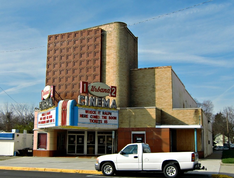
Here is a Streamline Modern Art Deco theater in Urbana, Ohio.
To the top of this page - Art Deco Architecture
To Art Deco Style - A look at the style in general
To Art Deco Houses - What Art Deco houses look like
To Art Deco Gargoyles and Guardians - An interesting collection of statues
To Art Deco and Archaeology - The archaeological influences on Art Deco
To Art Deco Classical - Art Deco and Classical come together
To House Styles - the Parent index page for all house style articles
Please!
Have A Great Story About This Topic?
Do you have a great story about this? Photos of great houses? Maybe you can add to our body of knowledge about this subject, or maybe you just have questions. Either way feel free to participate in our conversation.





New! Comments
Have your say about what you just read! Leave me a comment in the box below.