Color Wheel Chart
One of the most useful tools for decorating is the color wheel chart.
The color wheel helps you to understand what colors will work together.
Now, thanks to smart phones, the color wheel is even more useful.
The Structure of the Color Wheel Chart
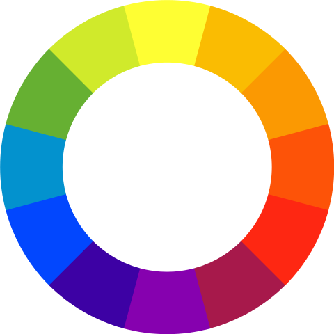
The traditional color wheel divides a circle into twelve segments. The three primary colors make up three of these segments, evenly separated around the color wheel chart.
The three primary colors are yellow, red and blue. Combinations of the three primary colors, with the addition of black and white, can form any hue, and any tint, tone or shade of those hues.
Midway between the primary colors on the color wheel are the secondary colors. Between yellow and red is orange. Between red and blue is purple. Between blue and yellow is green.

The space between a secondary color and a primary color is filled with a tertiary color. These are named with the combinations, for instance yellow-orange, or blue-green.
On some color wheel charts there is a variation in saturation, with the saturated hues on the outside, and then moving into the center they turn gradually more gray until they reach a gray center point. Others will add increasing amounts of white until they meet at a white center point.
The Mechanical Color Wheel
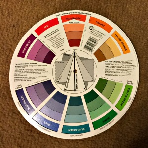
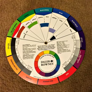
While the basic color wheel chart is just the circle divided into 12 colors, a mechanical color wheel consists of the chart, with a cover that rotates around the center. Cutouts in the cover reveal various tints, tones and shades of the basic color. Or perhaps they show what combinations of colors will look like.
I picked up this color wheel at a paint store for a few dollars. One side shows what colors will result if you mix the outer color with one of the primary colors. T
he other side shows each of the primary, secondary and tertiary colors on the outer edge. Inside are three concentric rings showing those same colors as a tint, a tone and a shade. The innermost part of the cover has pointers to help you find the various colors that will combine best with the color of interest.
It is this last feature that is especially useful in decorating.
 |
 |
There are several basic patterns for creating pleasing combinations of colors. These combinations are known as color schemes. The ways that we combine these colors to form schemes have names that relate to how you find these colors on the color wheel.
Analogous Color Scheme
Pick a color. Now pick the color on either side of that color. You can combine these three, along with their various tints, tones and shades. With an analogous color scheme your color choices will be stay in the same general color temperature.

This takes a braver color warrior than me, but I have seen it used very effectively.
Complementary Color Scheme
Pick a color. Now go directly opposite on the color wheel. This is a high-contrast color scheme.
Handle with care. The high-contrast nature of this scheme can be distracting.

Making the one color a darker shade also seems to help reduce the apparent contrast. Compare the above pic with the picture below. The difference is that the above is a shade of the magenta hue used in the picture below. The combination with the lighter color might be a better combination for some purposes, but it seems to me that the colors are fighting each other just a little more than in the picture above.

Split Complementary Color Scheme
Pick a color and its complementary. Now pick the color on both sides of the complementary. Next scrap the complementary. These three colors form the split-complementary. The contrast is less glaring than with complementary colors.

It is easy to see that this is easier on the eye than the complementary. Most people will find it easier to work with and better for a house.
Accented Analogous Color Scheme
Similar to the split-complementary but you keep the complementary. This gives you four colors. The three analogous colors form the basic palette while the complementary is the accent.
Triadic Color Scheme
Here your three colors are equally spaced around the wheel. Red, yellow, green is an example of a triadic color scheme. It is not as great a contrast as with the complementary, but it easy to create balance even when no one color dominates.

Tetradic Color Scheme
Choose two colors and their complementaries. There is no set formula for choosing the two sets of complementaries. You are essentially creating two different harmonies, and you have to be careful that these two work together. This is easier done if one color dominates.

Square Color Scheme
This is a variation of the tetradic. Here all the colors are equally space around the color wheel chart, so there is a harmony between both sets of complementaries.
Monochromatic Color Scheme
Here there is only one hue, but you are free to use the tints, tones and shades. It will naturally harmonize, but it can be boring. The only way to really mess this up is to use too many variations of tints and shades.
These groupings of colors work well, but the traditional wheel only gives you 12 hues to work with. If you want to paint your room a certain color chances are that color is not on the wheel, and neither will be its complementary or split complementaries.

Color Wheel Chart Apps
Here is where the various color apps come in handy. They essentially create the color wheel chart, but with infinite variety of colors.
With these apps you can pick a color from a photo, and it will generate matching colors, based on criteria you select. You could take a picture of a wall you want to match. The app then identifies that color, and finds its various mating colors. If your camera is a little bit off, you can manipulate the color selected until it is right.
These tools will not get you the name of the colors that you need. For that you will need to match the screen to the color samples available at the color store.
These are available both for mobile devices, as apps on web-sites, and as software programs.
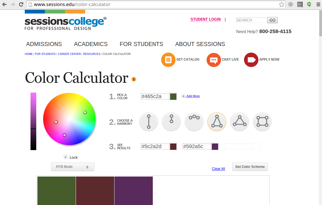
Here is a picture of a free color wheel, that allows you to pick colors based on six different color models. This is what I used to get the color schemes shown above.
It allows you to adjust both the hue and the chroma, but other apps show various tints, tones and shades automatically.
It does not have the ability to pull a color from a photo. Other apps do, but this one was free, and easy to use.

In conclusion, using a color wheel chart can relieve some of the stress of picking colors. It can even help you make bolder choices than you might otherwise choose and frees you from relying strictly on the color choices offered by the paint companies.
House Design - Home
Please!


New! Comments
Have your say about what you just read! Leave me a comment in the box below.