Gestalt Principles
In this section we deal with nine Gestalt principles, which explains how we manipulate the data we see in order to perceive objects. In the previous section we dealt with Gestalt laws, which are the big picture concepts explaining how we understand what we see.
- Simplicity says that we favor the simplest interpretation.
- Similarity relates to what things look like and how that effects how we group them.
- Proximity relates to their relative position and how we group them.
- Symmetry is the tendency to view symmetrical objects as figures against an asymmetrical background.
- Closure relates to the tendency of the eye to close an opening, or to complete the broken line.
- Continuity is a filling in of details in order to arrive at the simplest interpretation.
- Smallness means that we favor interpreting small objects as figures.
- Surroundedness is the idea that surrounding shapes tend to be interpreted as background to the shapes that they surround.Common fate says that objects that appear to be moving in the same direction are grouped together.
Simplicity
The German psychologists who developed Gestalt principles called this principle “Pragnänz”. This principle helps explain some of the others. We tend to try to reduce complexity to its simplest form or to its simplest parts. Much of what we do with the other concepts, like grouping objects, is our mind working out the simplest explanation for the data presented.
Similarity
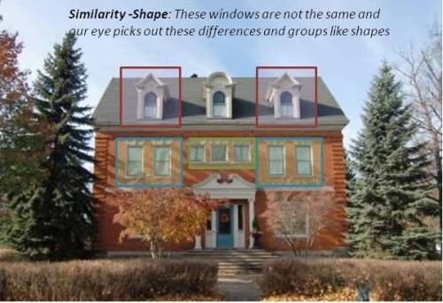
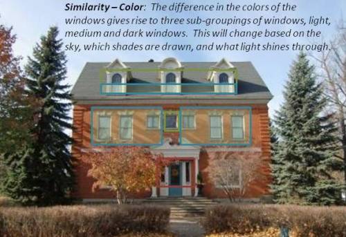
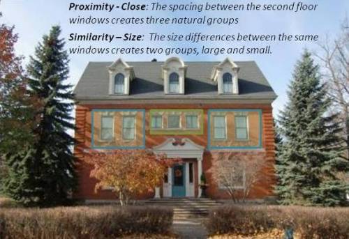
The eye can easily pick out items that look alike and the mind will group them together. But there are different ways in which things might look alike. The most obvious is shape. We group circles with circles, and squares with squares. Another way is color. In box full of silver bolts we would easily distinguish the one bolt that was gold. A third way is size. We group large objects together, or at least consider the possibility that they go together. In many cases our grouping activity is complicated by having multiple ways in which items can be grouped.
Proximity
We also consider an object’s spatial relationship. There are essentially four levels to the Gestalt principle of proximity: Close, Touch, Overlap and Combined.
Items that are close seem like they should be related. In a collection of objects we often identify sub-groupings of objects that are close together.
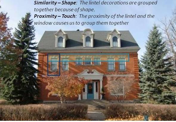
If items touch, even if dissimilar in size and shape, a relationship seems to exist between the objects.
An even stronger relationship exists when there is overlap. The exception maybe where the overlapping objects seems to create a new, complex shape, which may end up in its own, unique category.
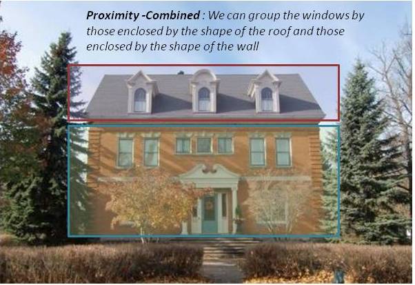
Finally, objects may be linked by proximity when they are subsumed into a larger shape. They then get categorized together into a group that we might call “those items inside the larger shape”.
Symmetry
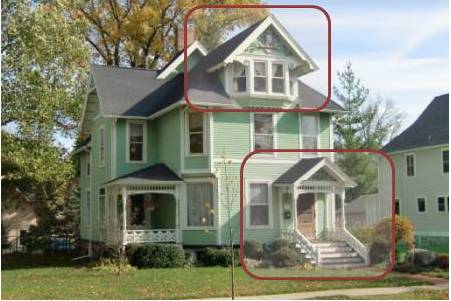
Objects that are symmetrical are favored as figures. Our mind pulls these out from an asymmetrical background. Perhaps this helps to explain the classicists love of symmetry in architecture. There is something innate in us that favors these forms.
In the picture below the symmetrical parts of the house stand out from the asymmetrical house. Using this principle is one way to create a focal point.
Closure
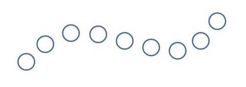
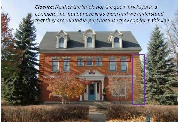
Our mind tends to connect the dots. Where there are discontinuities it fills them in. Where a collection of individual elements (like dots) can be connected together to form a shape (such as a line) our mind will tend to do this. Furthermore, our mind favors interpretations that produced whole, closed objects over open, broken objects.
[consider this paragraph][we understand that the brackets facing each other belong together][everything inside the brackets belong together][partly this is convention][yet this convention comes from our eyes naturally favoring closure]
Continuity
Related to the idea of closure is the Gestalt principle of continuity. Our mind will favor interpretations that rely on smooth continuity over interpretations that rely on abrupt changes of direction. In the picture below, the figure in the middle will be interpreted as two curved lines, as shown in the figure on the left, rather than two lines that each take a sharp turn, as on the right.

Smallness
When we see our mind is constantly working out what is figure and what is background. Small objects will be favored as figures against a background of large objects. Our tendency is to see what is small and ignore the large. This sounds like there is a theological lesson in this somewhere. From a practical standpoint it means that making something large isn’t usually the way to make it our focal point. There is more of it to see, but it will get lost as it becomes background.
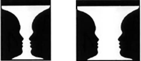
Consider our old friend the Rubin Vase. It is readily apparent when it is relatively small in relation to the faces. If the vase is large relative to the faces, then we tend to pick out the faces as the figure and the vase becomes the background.
Surroundedness
Related to the idea of smallness is the idea of surroundedness. If something surrounds something else it gets interpreted as background. It is not quite the same thing as saying that a large object will be interpreted as the background, because it adds the idea of position. If you want to ensure that the smaller object is perceived as the figure, don’t set it next to the large object, set it in front.
Common Fate
When artists draw comic book panels they will often show little lines behind the superheroes fists to show movement. Now imagine a collection of objects being thrown in the same direction. The artist might draw a bunch of these little movement lines behind each object. Our mind would interpret all these thrown objects as belonging together. It is a concept that is not usually applied to architecture, because buildings are static, however it might have application where there are decorative motifs that imply movement, such as with Streamline Modern.
These Gestalt principles are very basic to all design. They explain much of what we might call “optical illusions”. They apply to architecture in both a positive and negative fashion. A gestalt savvy architect can use these Gestalt principles to help define and accentuate his desired focal point, or to otherwise shape our interpretation of his building. Conversely, we sometimes see buildings where the Gestalt principles result in our perceiving a building much differently than was intended by the architect.
Top of Page - Gestalt Principles
Return to Gestalt Laws
Return to Architectural Concepts
Home - House Design
Please!
What do you have to say about these Principles of Design?
Do you have a great story about this? Can you add something to the topic?


New! Comments
Have your say about what you just read! Leave me a comment in the box below.