Home Additions That Don't Blend with the Original House
#9 of 10 Top Home Design Mistakes
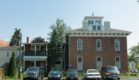
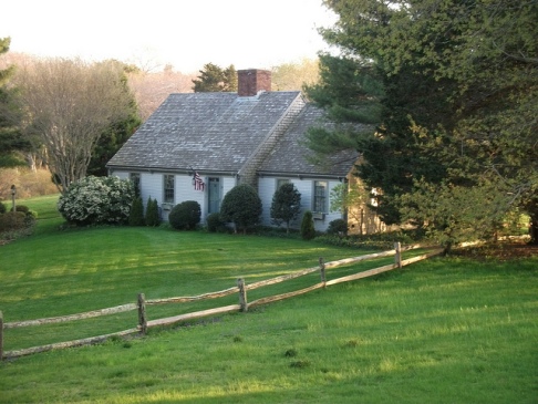
Home additions that don't match the original home is not a new problem. People have been expanding their houses for centuries.
The problem isn’t that they decide to expand it is how they do it. An expansion of a house can add to its aesthetic effect, but improperly done, it can detract from the whole.

First there is the issue of style. If the year is 1850 and you want to expand the Greek Revival house your dad built, you might decide to add a wing in the Italianate style. Greek Revival is old-fashioned while Italianate is modern and young (in 1850).
You might decide that this doesn’t quite look right and add a bunch of Italianate brackets to support the original Greek roof. The result? Yechh! But it was a common practice. I have seen many houses that have become a mish-mash over the years.
The same basic thing happens today. A Craftsman-style home expands sideways with a distinctively modern twist. A ranch home morphs into a two-story colonial. Such syncretic houses aren’t inherently wrong, it is just that it is difficult to reconcile two opposing styles. A combination of styles could be beautiful, but rarely is. If you are lucky they achieve a quirky union, where they look interesting rather than lovely. More likely the ugly gets compounded.
Even staying within the same style there are pitfalls with an expansion. If the original house was good it had a certain look it had achieved. Any changes will upset that look. This is especially true for those situations where the house looked great from all angles. Care must be taken to understand what made it look so good and to ensure that the addition adds rather than detracts from that special something.
Of course, if the house was ungainly to begin with then an addition is an excellent opportunity to correct what is wrong.


Editor's Note - I could use some help here. Anyone with good examples of mismatched home additions, please send me a pic. You can use the comment form down below, where it says "What Are Your Top Ten".
To Top Ten
What are Your Top 10?
Tell us what makes your top 10 list, or tell us about one of the ones we posted. Maybe you have examples. I would love to add more pics to my articles.
 Next
Next


