Mission Revival Architecture
What is Mission Revival architecture?
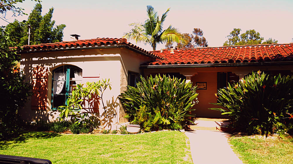
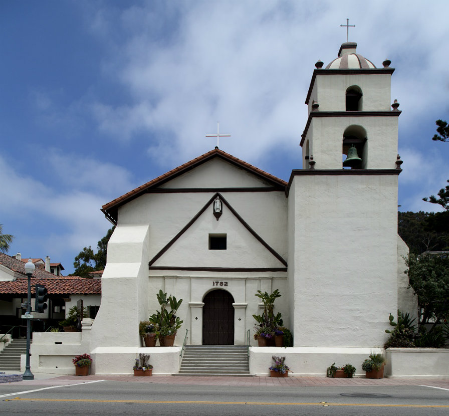
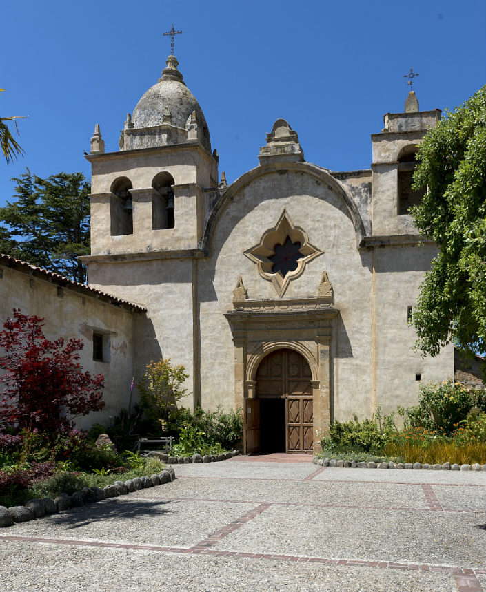
It is this…
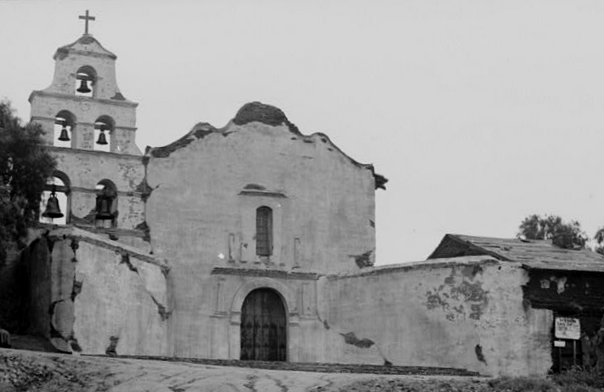
And this…
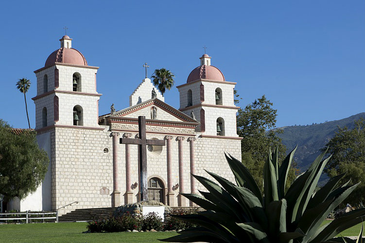
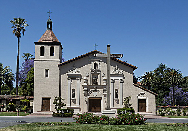
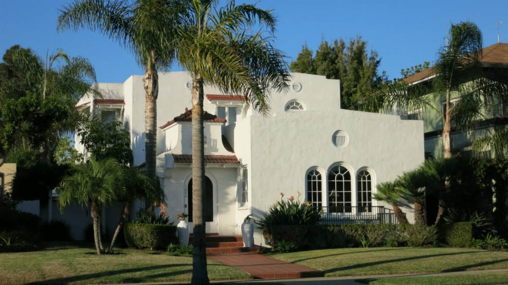
And a lot of stuff like this….
Key Features of Mission Architecture
Its key features are adobe walls, Spanish tile roofs, or flat roofs, deeply inset windows, colonnades and balconies that bring the living space out beyond the walls, open courtyards or private gardens behind outer walls, and baroque, curved pediments.
Inside you have exposed ceiling beams, and exposed flooring above, handcarved details on the woodwork, often on very dark wood, and Mexican clay tile floors. Colors are usually earthtones, but sometimes strong pinks are used, and white is common. The vibrant blues and green and reds that you sometime find in Mexican homes were usually absent in the revival to the north.
The Roots of Mission Revival Architecture
Mission Revival architecture was popular from about 1900 to 1915, but it never really died out. It just transformed to a more flexible adaptation of the original Mission look, and is still produced today.
Mission Revival architects took their visual clues from the early Missions established by the Franciscans in California, which were much like the Missions established in other parts of Mexico, which took their clues from the Baroque architecture that was prevalent in Europe, in Spain, and later in New Spain.
The difference lay in the use of local materials and local artisans. The California Missions were made out of adobe, sun-dried bricks. The Franciscans adapted the local construction to create Baroque churches far from the centers of civilization. They could not rely on guild-trained stonemasons from the old world, so they made good with what they had.
|
A Book, An Event, And A Movement
In California, following the Treaty of Guadalupe Hidalgo that ceded it to the United States, the architectural story was bringing the styles of the Eastern United States to the West. A lot of houses in built California in the 1800’s reflect the architectural trends of the East Coast and Midwest. You have Italianates, and Carpenter Gothic and later Queen Anne and Second Empire looks.
So what made Californians stop and realize that what they had locally was pretty cool in its own right? I will give credit to three things, a book, an event, and a movement.
The book is Ramona by Helen Hunt Jackson, published in 1884. The book presents a romantic portrayal of the California way of life at the end of the war and contrasts it with the destructive qualities of the Americanization of the California. The book was a hit and its sympathetic portrayal of the Mexican culture caused many people to reconsider how they viewed the Mexican influences in the region. A nostalgia developed for that slow, easy-going culture.
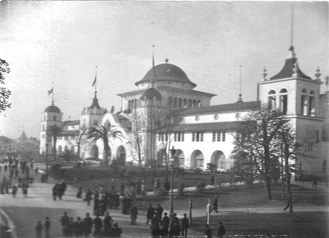
The event was the World’s Columbian Exposition of 1893 in Chicago. California had it’s own building, and it went with a building that looked like it was taken straight out of the Spanish Colonial times, albeit a good deal bigger. This put the Mission Revival architecture on a big stage, and it inspired a lot of architects to start thinking about how they could incorporate this new old look.
The movement was the Arts and Craft movement, which had grown out of the Gothic Revival, and was responsible for a lot of nostalgic look backs into earlier architectural forms. It emphasized craftsmanship and its practitioners tended to show off that craftsmanship. That meant that a lot of joinery that could be hidden was exposed and put on display. Things like ceiling beams were left to entertain the eye rather than remain hidden behind plaster.
The old Mexican architecture often had exposed ceiling beams with herringboned floorboards above, often painted to emphasize the pattern. Details like this delighted those who were swimming along in the current of Arts and Crafts so they took to the Mission style easily.
Where Mission Revival architecture differed from much of the Arts and Crafts movement’s various branches was the thick adobe walls. The thick walls meant you could create some interesting looks with deeply inset windows. It was always going to be a heavy look, often ponderous, but also solid and rooted.
The book got people thinking about the cultural roots of the area, the event gave notice to the world what was going on in California, and both of these fed into and were fed by the artistic milieu that was the Arts and Crafts Movement. What resulted was an explosion of Mission Revival architecture, both public and private. Mostly this was in California and the Southwest but it also showed up in some rather unlikely places that had nothing to do with Spain or Mexico.
Mission Revival Architecture Amidst its Peers
While the Missions were large public places the style was used for a significant number of private residences. Here the architecture was often less referential of the Mission structures and more in-line with the houses of the colonial era. The Spanish hacienda came to life again in a suburban setting. The humbler homes either took on the look of the adobe homes of the small Mexican homesteaders or they adapted mass-market house plans with stuccoed walls and Spanish tiles. The bungalow was adopted into the Mission Revival family, in some cases so successfully that you would think it was a native form, at other times looking very much like a foreign invader.
The Mission Revival created an interest in Spanish and Mexican and even Native American influences that went beyond the styles of the California missions. In New Mexico a Pueblo Revival took its cues from the flat-topped adobe structures of the indigenous Pueblo tribe, which in turn had been copied by the colonizers coming North from Mexico. In Florida a Spanish Colonial Revival looked across the broader Spanish world for its inspiration. This often blended in the Mediterranean Revival style which looked back to the Old World.
All of these revival styles went national, and they had common features, which makes it confusing to tell them apart. A good part of the time architects were taking strong design elements from these styles and blending them with other forms. This makes the whole mess even more confusing. But frankly it doesn’t really matter. Architectural styles are usually fluid, changing with the times, and only later getting segregated out into narrow definitions.
Below is a collection of photos that better define the look than my words alone.
Whitewash and Spanish Tile work well together. The small tower over the entrance, and the small angled rise of the parapet wall tie this in to the Missions of California. The little curve at the base of the second story of the tower is reminiscent of the curve incorporated into the buttresses and parapets of Spanish Baroque architecture.
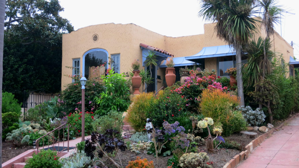
California gardens are pretty cool, but the reason I show this house is the interesting way that the architect created a little mini-courtyard space by having the entry come in from the side of this little indent. Courtyards of all shapes and sizes are a big part of Mexican architecture.
It also creates a simple entrance transition. This is Christopher Alexander's pattern 112, which prepares people psychologically for leaving the open space and entering into a house or building. You can read more of his beautiful architectural philosophy in
A Pattern Language.
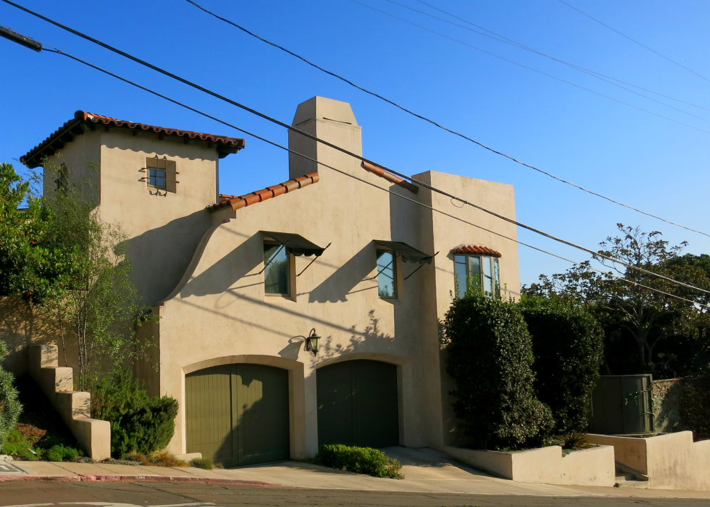
This is an interesting shape. It owes a lot to the shapes used in Mission Revival architecture, but there is a decidedly contemporary feel to it. Part of that is the garage doors, and part the rectangular massing on the right that breaks up the curved form of the end wall.
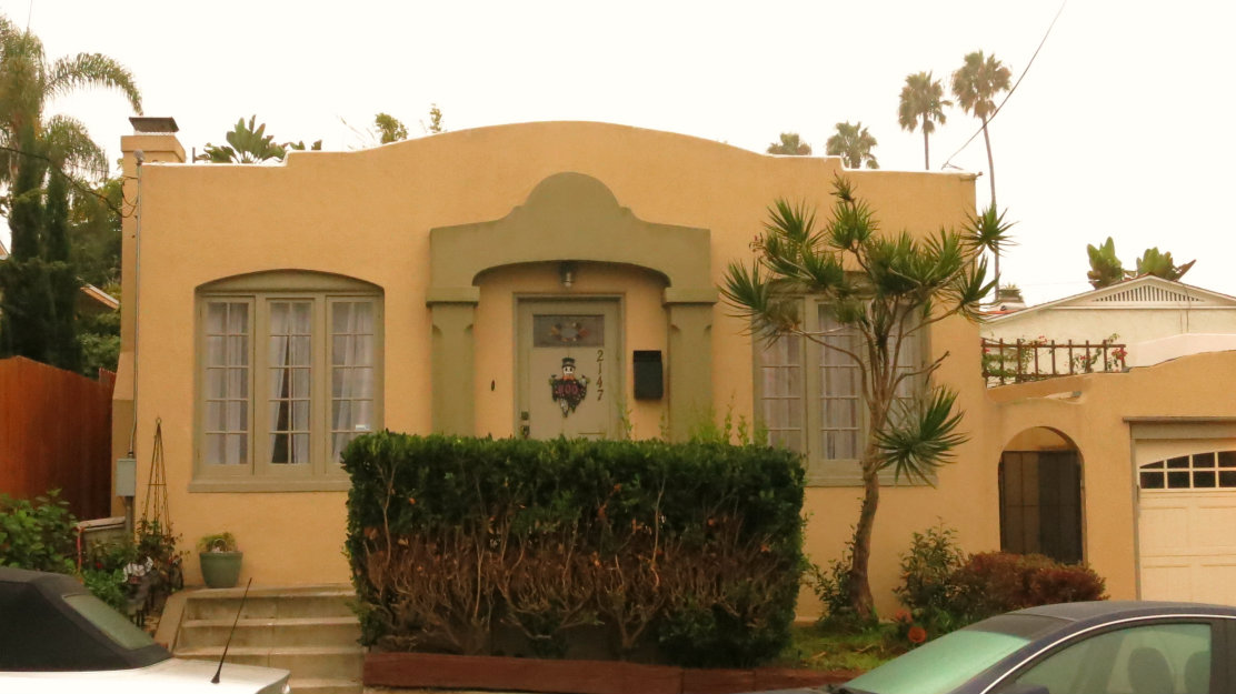
The bungalow is a layout rather than a style and it adapts well to many styles, including Mission Revival architecture.
 |
 |
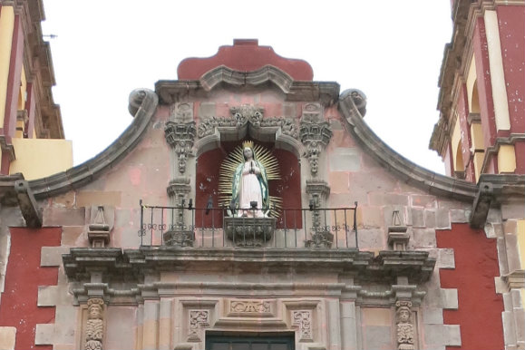
The bungalow above has a hint of a curved pediment that was commonly used in Mexican Baroque architecture. It is often included in Mission Revival, especially on public buildings.
The pediment on the left is from Nuestra Señora de Guadelupe church in Querétaro and the one on the right is from the Mission San Diego de Alcala.
With a few changes this could be a Federalist style home, but it is clearly in the orbit of Mission Revival architecture, with its Spanish tile roof and stucco exterior. The arched windows and the dark wood trim also fit well with the Mission look.
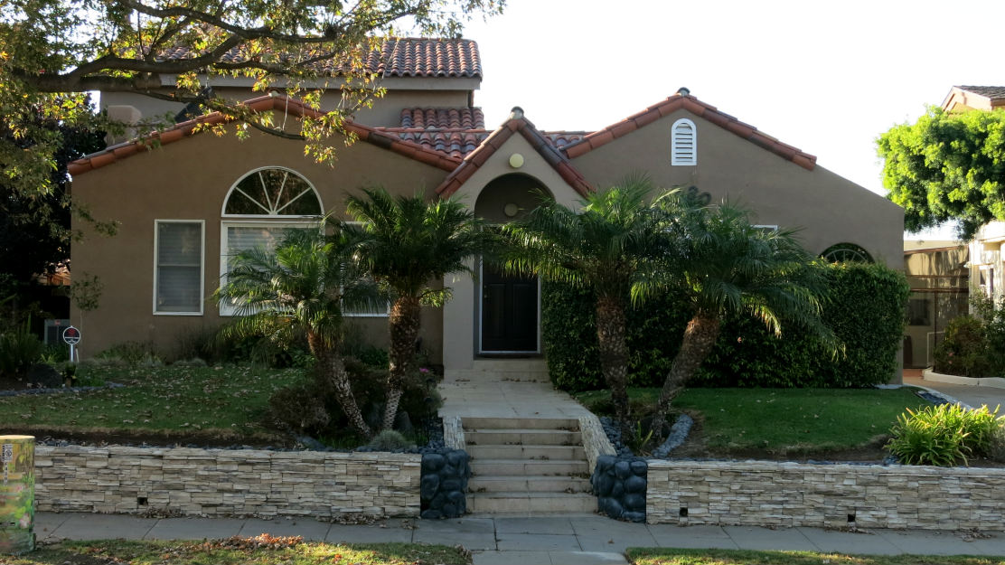
A lot of Mission Revival homes are like this. The Mission look is confined to a thin skin of stucco and a few tiles. This looks like a couple of double-wides. Put up lap-siding and take off the Spanish tile and it could be a typical Midwestern home.
I might call this pseduo-Mission Revival architecture, but only because it doesn't truly sell the adobe look. The windows are flush with the outer wall, which makes the walls look thin, and they probably are. It is a fine house, but it would look much better if the windows were recessed so that the walls appeared to be thick.
Blended Styles
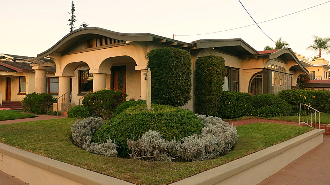
In the Mission Hills neighborhood of San Diego there are a lot of Craftsman homes and a lot of Mission Revival. It was natural that they would marry. At least one builder did a credible job of joining the two.
The stucco skin is a necessary element, but what sells this for me is the arcade on the front porch. The flattened arches and the simplified columns make it modern, but the reference to Spanish architecture has not been lost.
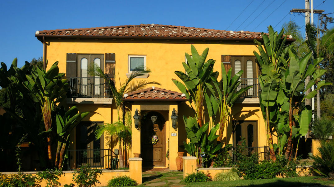
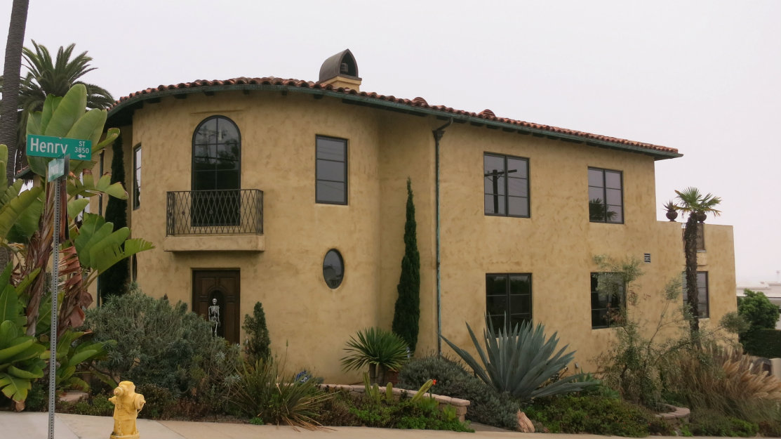
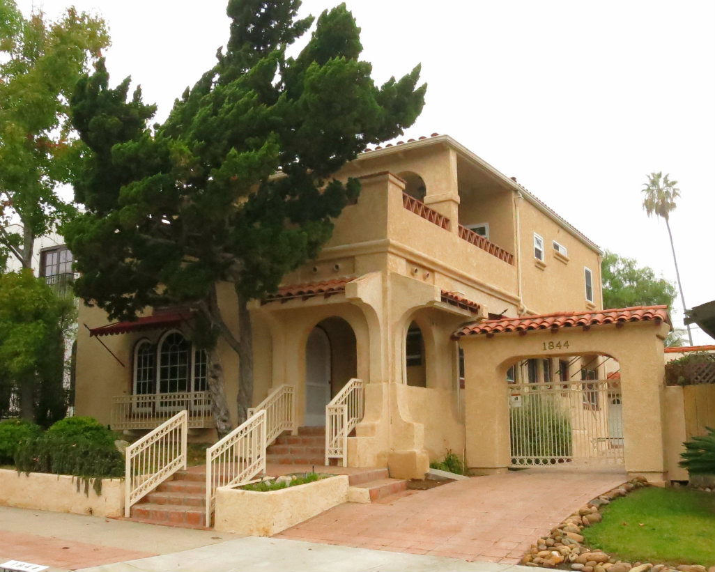
This could be considered a Mission Revival blended with an Italian Villa style, but you could also call it a Spanish Colonial Italian Villa blend, or just Spanish Colonial.
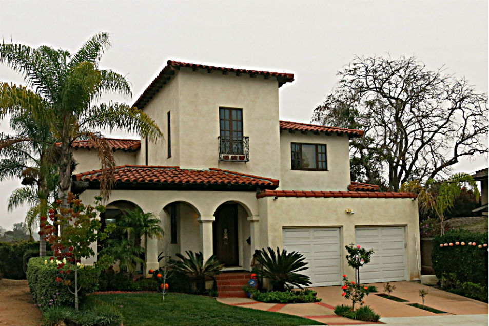
I see influences of the Mediterranean Revival and Spanish Colonial Revival in this house, but there really isn't anything that couldn't have been found in a colonial California home.
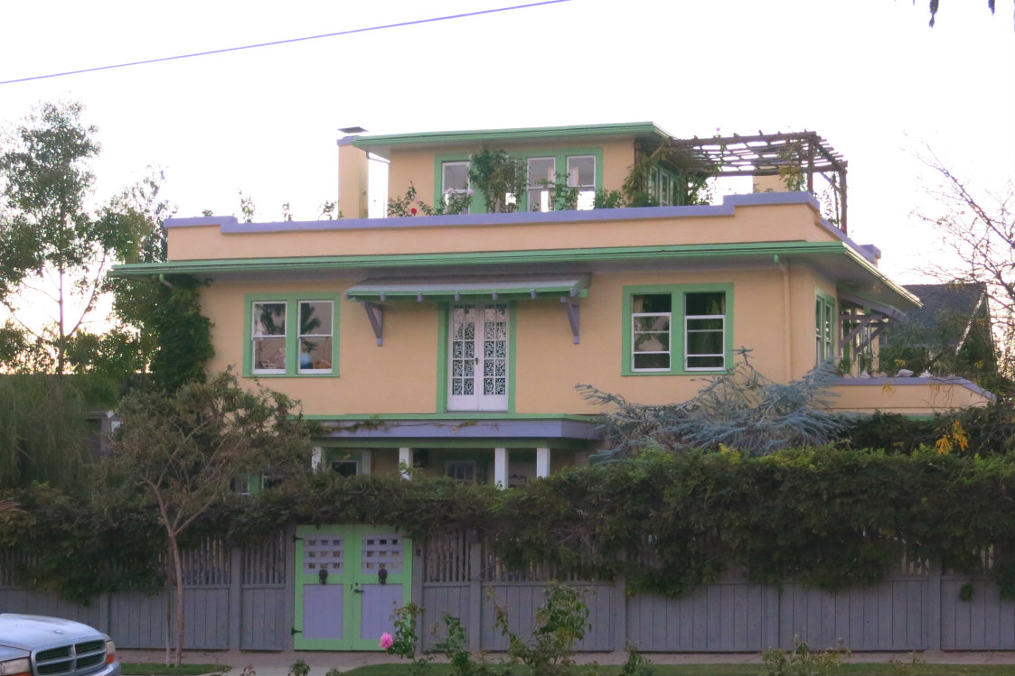
Prairie style was popular about the same time as Mission Revival, and San Diego has some interesting blends of these two styles. What an awesome house. I love the vibrant colors, although I think the lilac fence is a bit much.
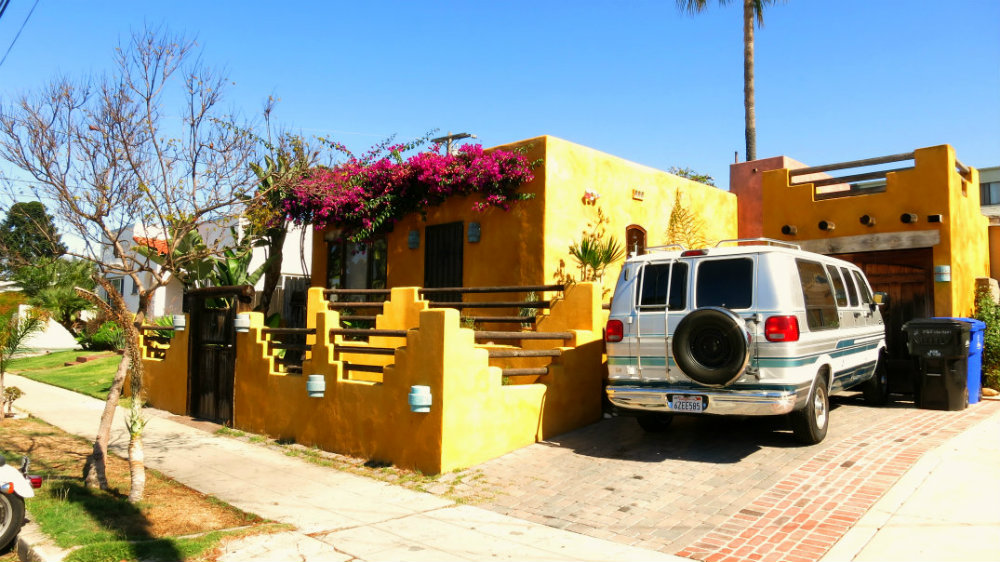
This is a Pueblo Revival home, but it is in a neighborhood full of Mission Revival homes. The flat roof alone doesn't make it Pueblo, but the projecting roof beams seals the deal. The crenelated parapet is an innovation that the Pueblo Indians wouldn't have known, but otherwise this looks like many homes you would see around Santa Fe. I could make this into Mission Revival by adding a curved baroque pediment in the center of the house, or by adding a Spanish tile roof in lieu of the flat roof.
To Top of Page - Mission Revival Architecture
To House Styles
Home - House Design
Please!


New! Comments
Have your say about what you just read! Leave me a comment in the box below.