Proportions and The Vitruvian Man
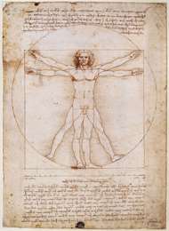
The Vitruvian Man is a drawing by Leonaro da Vinci that puts man at the center of both a square and a circle, with the implication that man is in harmony with world around him. Where did Da Vinci get this idea?

Consider yourself as a baby. The first thing you really noticed was your mother’s face. The proportions of the face are ingrained in you from an early age.
Likewise the proportions of the men and women around you were imprinted at least from the time you began to walk. You walked among giants, with their knees at the level of your eyes. I mention this because human proportions are not really scale dependant. We are used to seeing the proportions now in a scale that matches our own body, but once we saw them on a monumental scale. That monumental scale can be intimidating, but it is less scary when it is presented with proportions that are familiar to us from our earliest years.
Long before the Vitruvian man illustrated this point the ancients viewed the proportions that are present in nature as worth emulating. Proportions that were unnatural would appear to be out of harmony, and they took harmony very seriously. To understand why we have to look to Pythagoras.
He taught that God and the universe were related proportionally. God, the perfect, while creating something lesser than himself, created it in harmony with himself. To this basic idea of harmony Pythagoras starts getting mathematical and we will look at that later, but for now just understand that there was a beautiful harmony in nature and what reflects that harmony will itself be beautiful
Which brings us back to man. Man, the creature designed to be in harmony with his creator, could serve as a model for what is beautiful.
Vitruvius, in his 'Ten Books on Architecture' provides a list of proportions of the face and the body. He also provides this definition of proportion: “Proportion is a correspondence among the measures of the members of an entire work, and of the whole to a certain part selected as standard.” In the proportions given below (from Vitruvius) that standard is either the height of a man, or the height of the face.
-
The Face
- From the chin to just under the nostril is 1/3 of the face
- From just under the nostril to the eyebrows is 1/3 of the face
- From the eyebrows to the hairline is 1/3 of the face
-
The Body
- The face, chin to hairline is 1/10th the height of a man
- The head, chin to crown, is 1/8th the height of a man
- From the breast to the hairline is 1/6th the height of a man
- From the breast to the crown is ¼ the height of a man
- The length of the foot is 1/6th the height of a man
- From the wrist to the tip of the the fingers is 1/10th the height of a man
- The length of the forearm is ¼ of the height of a man
- The breadth of the breast is ¼ of the height of a man
- From fingertip to finger tip equals the height of a man
This tells us that the ancients considered the proportions of 1:3, 1:4, 1:6, 1:8 and 1:10 as being proportions appropriate to man. Without elaboration Vitruvius states that architects also used the proportions of other parts of the body, so this list is not complete.
I measured some of these on myself. A few were spot on, most were a little off. Especially those related to the hairline. Evidently my hairline is no longer ideal and I am a little out of proportion. There is also the question of how to take certain measurements, such as the “breadth of the breast”. However, if you looked at lots of people in their youthful state you would find that these proportions generally hold.
Vitruvian Man: Man at the Center
 Da Vinci's Vitruvian Man
Vitruvius goes on to talk about the navel being the center of man, and some of his descriptions in this section get a little confusing, but Leonardo DaVinci, who studied both architecture and anatomy, was able to reconcile Vitruvius’s vague descriptions graphically in his famous sketch “Vitruvian Man”. As shown, man fits in both a circle and a square. He uses this to reinforce the idea that there is a natural symmetry to man and both symmetry and harmony should be employed in our buildings.
The Vitruvian Man, and Da Vinci, have been criticized for putting man at the center. The implication is that Vitruvian Man is a humanist representation of man without God. This is a gross misunderstanding. Vitruvian Man in the middle is man in harmony with all of God's creation.
Moving from his descriptions of man's proportions Vitruvius gets into the perfect numbers, but he gets there by going back to using man as a standard for measurement. The Greeks, like every other culture, used their body parts to measure things. They used fingers, palms, forearms and feet. The number 10 was considered perfect because we have 10 fingers connected to our palms. Likewise, for some mathematical reasons I will not get into, mathematicians considered six to be the perfect number, but this was reinforced by the fact that there were six palms to the cubit (the forearm) and man was as tall as six of his feet. So they considered both 10 and 6 to be perfect, and adding two perfect numbers should also yield a perfect number, therefore 16 was perfect.
These three numbers formed special proportions 6:10, 6:16, and 10:16, all theoretically derived from man.
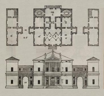
The earlier mentioned proportions were not practical for figuring room proportions. It would be strange to have a house full of rooms that were either four or six or eight times longer than they were wide, but it was practical to have rooms in the proportions of 6:10 (such as a 12 foot by 20 foot room). Since there were three numbers you could even put the width, length and height all into perfect proportions. You could for instance have a room 15 feet wide by 24 feet with a 9 foot ceiling, which is in the proportions of 10:16:6.
Andrea Palladio, in his The Four Books on Architecture reintroduced these same proportions to a new generation. The rooms of his houses often had these proportions, as you can see in the drawings in his book.
They were also appropriate proportions for laying out the footprint of a Greek Temple, as we shall see later.

Return to Perfect Proportons
Return to Architectural Concepts
Home
Please!


New! Comments
Have your say about what you just read! Leave me a comment in the box below.