Vitruvius: 10 Books on Architecture
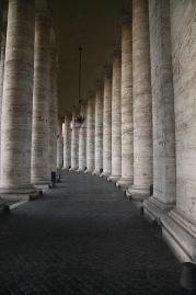 Columns forming concentric circles at St. Peter's in Rome
What he said was not original. What he did was put together a lot of ideas that had been in existence for hundreds of years. As no other architectural primers survive, his work has proved invaluable in helping us understand the architecture of antiquity. Most of his content is of a practical nature, but in the second chapter of his first book he provides five principles of design:
- Order
- Eurythmy
- Symmetry
- Propriety
- Economy
As I explain these you will find that they make a lot of sense, but lack sufficient detail to be useful. To say that you must consider “order” does not tell you what constitutes good order.
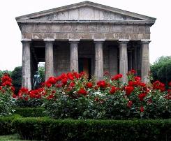 This replica of a Greek temple is found in Vienna
Eurythmy – Is the beauty of the arrangement in regard to proportion. Shall we just rename this one proportion? Eurythmy is a neat word, but no one will know what we are talking about. Proportion is more easily understood
Symmetry - The parts should agree with each other. This is not just an issue of mirroring, where the left side of a building matches the right, but of parts appropriately matched, as an arm to the body or a hand to the arm.
Propriety - The building should correspond to the culture and the circumstances. He gives some examples relating to Greek temples and religion, so I will give an example from our world. A church should look like a church and not an office building or a warehouse. A bank should look solid, like it’s a place where you would trust your money to stay for a while. Propriety also is applied to the parts relating appropriately to each other. Having a beautiful marble entryway leading into a small room made with cheap materials would be a violation of this principle.
Economy - As it sounds, the architect must consider cost in relationship to the type of building.
If I have been vague about the above principles I apologize. Vitruvius was vague and he understood this stuff better than I do. I deal with each of these in the Principles of Design section. Three, order, propriety and economy, are not usually dealt with in the modern world as constituting principles of design, so I have tacked them on to the end of that section.
In Chapter 3 Vitruvius also brings up three criteria that good architecture must meet: durability, convenience and beauty. That is a building should be built to last, it should be fit for use, and it should be pleasing.
In books 3 and 4 Vitruvius deals with temples and talks quite a bit about proportions. Most of this is very specific to temples, but in book 3 he brings up the idea that certain proportions are pleasing because they occur in nature and we are used to them. The proportions that we see the most are the proportions of the human body and the temples demonstrate proportions that correspond to the natural proportions of our bodies.
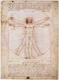
This is an idea that was influential in the Renaissance rediscovery of classical architecture. Leonardo da Vinci made a famous sketch that demonstrated these proportions. It is called the Vitruvian man and is shown to the right. I will deal with the proportions involved in a separate section on proportion within the Principles of Design section.
The stuff that concerns us here are the three criteria identified in Chapter 3, durability, convenience and beauty. These don’t sound very controversial, and they shouldn’t be. They are basic ideals that Vitruvius inherited and has passed on to us. Accept these values and you will design one type of building. Throw them out and the buildings you design will be different. Sometimes subtly different. Sometimes drastically different.
Durability - In suggesting that durability is a foundational principle Vitruvius is not really saying that all buildings must be built to last for many generations. As a Roman engineer he would have dealt with many temporary cantonments that were meant to last only for a season. In suggesting economy as a design principle he recognizes that costs are an important consideration.
What he is implying here is that great buildings need to have permanence as one of their qualities and in designing for permanence you are performing one of the essential tasks of an architect. It does not take an architect to create a building that is only designed to last a winter. Conversely, it does require an architect to design a building that will not only last through the ages, but provide value and beauty through the ages.
In general, I think this quality is not in danger, except in two regards. One, industrial buildings are often built with the idea that the future is too uncertain to invest much money in permanence. Build it to last one generation as you are likely to have completely different needs in another. Two, modern buildings, having abandoned the basic forms and ornamentation of countless generations, may find that their tastes are too temporal. That is, they please the current generation (in some cases) but don’t have the legs to last.
Conversely, houses, even cheaply build houses, will last several generations. Even wood houses, properly protected against termites and protected from the accumulation of moisture should last almost indefinitely given proper maintenance.
There is a philosophy that says that we can only design for the current generation, but even these architects are vain. They want their buildings to last as monuments to their creativity and so they design them to last. From a mechanical and engineering standpoint most will continue to stand.
Convenience – Fitness for use. As we will see later, the modernist took up the theme “Form follows function”. I don’t really think they thought they were being original. Rather they thought that they were returning to a core value that was ageless. Here Vitruvius says the same thing.
Good architecture can never just be beautiful. Nor can it just be durable. If it doesn’t serve its function well the architect has failed. Think of a beautiful new stadium well designed in all of the basic engineering. Is it a good stadium if it is hard to see the field? Is it well-designed if it takes twice as long to get in and out as compared to its competitors? Can it truly be a good design if it has beer concessions to serve 100,000 and bathrooms to serve 10,000?
There are many aspects to any function and the building must serve them all.
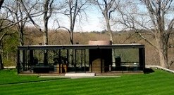 This is Philip Johnson's famous "Glass House". The only privacy is in the bathroom.
And yet, these guys did have a genius about them. Classical architecture was never intended for skyscraping office buildings that can hold tens of thousands. You could not use that form without drastically changing it, so why not start from scratch and begin again? The modernists, for all their faults, did offer an alternative to stacking Greek temples on top of each other .
Beauty - Vitruvius offered only three criteria for something being beautiful:
- it is pleasing to the eye
- it is in good taste
- it is well-proportioned.
At least in this short chapter he went no further. We can flesh this out a little bit by noting that both Plato and Aristotle held beauty to be a matter of simplicity, harmony and proportion working in concert. This was a basic understanding of beauty held by the ancients, so when Vitruvius talks about good taste and pleasing to the eye he was referring to a standard that valued simplicity and harmony.
In a later chapter Vitruvius deals with frescoes and derides certain fashions in frescoes that were popular but that he considered in poor taste. The jist of his argument seems to be that they pictured things that could never be, that were contrary to nature. In this he enters into a controversy that we can recognize today. I will not take a stand here on what ornamentation is appropriate to architecture but I will quickly outline some of the schools of thought on this topic.
The ancients, like Vitruvius, often decorated with mosaics, frescoes and statues in a realistic fashion. They were limited in their ability to paint realistically, but certainly their sculptures strove for realism.
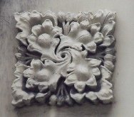 The gothic masons generally were more representational in their carvings. Flowers and vines decorating their stone moldings did not fool the eye into thinking they were flowers and vines, but they clearly communicated what they were intended to be. The great architect and designer Augustus Welby Northmore Pugin made a compelling argument that this was appropriate and good and that the classical decoration, where realistic, was in poor taste.
Abstract design is perhaps the least used, mainly because the same generation that was creating this genre was also abandoning ornamentation in building. We may see great abstract sculptures or mobiles in atriums, but we rarely see abstract ornamentation thematically applied throughout a building.
Which brings me to my final point. Vitruvius did not spend much time on ornamentation, but his comments on frescoes, and on various other building details seems to indicate that he took it as a given. It was only part of beauty, but it was expected.

Return to Top - Vitruvius
Forward to John Ruskin: The Seven Lamps of Architecture
Return to Architectural Concepts
Home
Please!
What do you have to say about these Principles of Design?
Do you have a great story about this? Can you add something to the topic?


New! Comments
Have your say about what you just read! Leave me a comment in the box below.