Young House Love
"Young House Love" is the blog of Sherry and John Petersik, as they renovate their home. They aren't professional flippers, but they are on their third home in eight years of marriage.
As they put it "we're not experts just two happy homeowner who love to learn as we go and share our adventures (and misadventures) with the world." Yes, they actually talk that way. The blog is up beat and peppy with a dose of young love thrown in.
The Homes
Perhaps I envy their perky cheerfulness. Whatever the cause I like this "Young House Love"
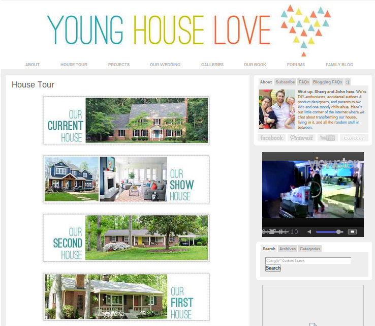
I first met them in print while they were on their second house. Recently they moved on to their third house. In addition, they designed a show home, so their blog provides a tour of four different homes.
I'm glad they have moved on from their second house. Much as I like their blog, it spent a little too much time praising the joys of a ranch home, and I am definitely not a ranch home kind of guy.
Now they have a lovely Georgian-style home in the neighborhood they have always dreamed of living in. It will be interesting to see how many more homes they renovate now that they have reached their dreams. I suspect many more are on the way.
The Cute Couple House Blog Layout
Projects
This is a true blog, meaning the posts are arranged by date, and the older stuff is off in archive world and you might not be able to find it. "Young House Love" gets around this problem with several themed sections that link to the old articles.
The tab called "Projects" is one way to find posts related to different improvements they have made over the years.
It is sub-divided into categories like "Art", and "Paint", and "Cleaning and Organizing".
House Tours
The also have all their houses separated out in a tab called "House Tours". Here they offer up their three house renovations, and their show house. Clicking on any section will pull up a summary of all the work they have done on that house. Mentions of projects will link into the original article about that project, so this covers the same ground as the "Projects" tab, just organized differently.
Galleries
There is another section called "Galleries" that offers three different venues. In "House Crashing" you get to see a lot of photos of other people's homes.
The "Inspirations" Gallery has photos arranged by room and by color, and these link in to longer article where those photos originally appeared. I rather like this visual index format and am considering doing something like this for my website. Thus the name, "Inspirations", is apt and possibly prophetic.
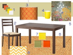
"Mood Boards" features various mood boards featured on the blog over the years, again arranged by color and by room. For those who haven't wasted too many hours perusing interior decorator magazines a mood board is a collection materials and paint swatches and photos of furniture that you put together on a board. The idea is that you can see how the separate items fit together. The modern equivalent is the virtual mood board, where the material and paint is replaced with pictures of material and paint.
The cool thing is that the boards are easy to create digitally. Just grab photos from blogs and catalogs and plop them onto Powerpoint or some other graphic-focused program. It can be a lot like window-shopping, or it can be a serious effort to plan a room before you commit the money.
Family Blog
But this is more than just a home design blog. I'd call it a home blog. When you pull up "Young House Love" you aren't just learning about renovation and design, you are learning about the Petersiks.
They have a blog-within-a-blog appropriately named "Family Blog". Many of these deal with their daughter Clara, because that is what young parents write about. It is sweet, and worth a read, especially if you find you take a liking to the Petersiks.
Wedding - The "Love" in Young House Love
My favorite area in the whole website is the tab labelled "Wedding". As the father of two daughters I take kindly to anyone promoting the idea of affordable weddings. John and Sherry managed a backyard wedding for under $4,000. Christa, are you reading this?
If you find reading about weddings a little too sappy I suggest that you skip links to the "Anniversary" pages. As for me, there is nothing I enjoy more than reading about how two people who really love each other plan their romantic evenings. I can feel my icy heart starting to melt even as I write this. It's like a Valentine's Day version of The Grinch.
Their Specialty
Where "Young House Love" really shines is the before-and-after photo comparisons. In almost every project they showcase they'll photographically summarize their work. Sometimes that is all you will get, and sometimes they will go into great detail.
 |
 |
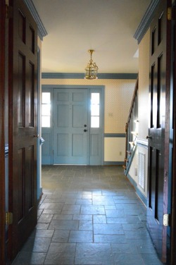
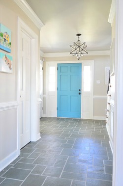
Take the foyer in their new home. The before photo is on the left and the after photo is on the right.
They painted the dark wood white, painted the blue trim white and went with a sky blue for the door. They also added a lot of texture to the floor by cleaning the grout.
I did the same thing with dark wood in my old house. I love wood, but when it is too dark it can drag the whole house down.
I am not a great fan of the change in blue, but the cool thing about paint is that you try it again if you don't like it. I think they like it.
The grout cleaning project turned out to be one of the most useful articles that you will read if you face a grout problem. Tiles are awesome, but grout sucks. It gets dirty, almost like people were walking on it.
Sherry details her many failures to get the grout clean, and then shows off her discovery of Polyblend Grout Renew. It seems to me that it is really a grout paint, but it did the trick.
With the light color grout the individual slate tiles stand out. It makes the room more interesting. The down side is it will just get dirty again. Oh well, the same can be said of most of our projects.
The Downside
Here is where I tell you what I don't like about "Young House Love". To do this I am going to have to get picky, because there isn't much I don't like here.
The thing I am going to pick on is their landscaping, which is really funny because it looks better than mine. My yard is one of those "before" shots, in part because I don't tame my bushes often enough, and I am too cheap to pull out what didn't work.
My problem with their landscaping isn't that they don't do it well. They do. In fact it is the epitome of modern suburban landscaping. Lots of mulch. Lots of grass. Tame the trees. Very pretty. Not much soul.
Its the same design motif used to landscape office parks.
So my pet peeve isn't really with "Young House Love". My problem is with them buying into the same aesthetic as the rest of America. Well, I'll deal with that battle on another day.
To Top of Young House Love
To Blog Reviews
Home again Home again Jiggety Jig
Please!


New! Comments
Have your say about what you just read! Leave me a comment in the box below.